
With all the World Cup jerseys finally out in the wild, it's time to create a ranking with the best and worst-dressed teams in the tournament.
In general terms, there is consensus on naming adidas as the brand with the best designs for the event, while Nike and Puma didn't seem to have tuned in with the fans' wishes.
I'll be honest, some collections have grown on me since their launching – France and England, to name two – but others are not moving the needle.
Sorry, USMNT.
World Cup 2022 jersey ranking
Without further ado, let's dive into the matter.
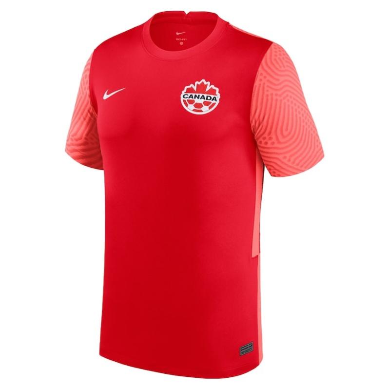
32) Canada (Nike)
Look, the soccer jersey industry is a vile money-sucker with an excessive number of releases every year, but c'mon Nike, how on Earth were you not able to produce a World Cup jersey for Canada? They haven't been in a WC in 36 years and you stick with what they have been using in the last two years, which is already boring and too similar to what we see in Russia 2018?
No wonder the same Canadian players started to cover your logo when celebrating a goal. Lazy!
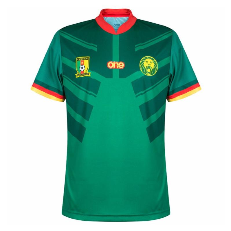
31) Cameroon (One Sport All)
The Indomitable Lions are in some legal battle with French brand Le Coq Sportif and, in the meantime, they will be wearing these abhorrent looks.
Is it an armor? A bad copy of the Transformers logo?
You used to be cool, Cameroon.

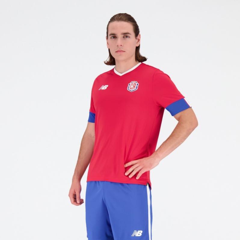
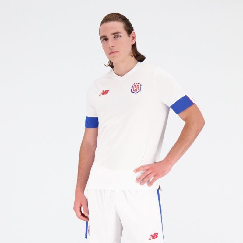
30) Costa Rica (New Balance)
Oh, boy! This is plain, uninspiring and it has chunky cuffs.
I wish los Ticos would have a jersey embodying the Pura Vida national motto, something reminding us of the attitude of facing life with joy and having a positive mind but not this dull piece of fabric.
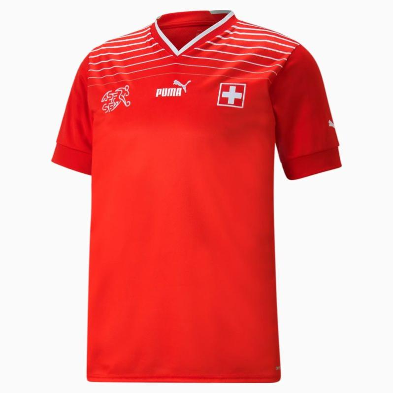
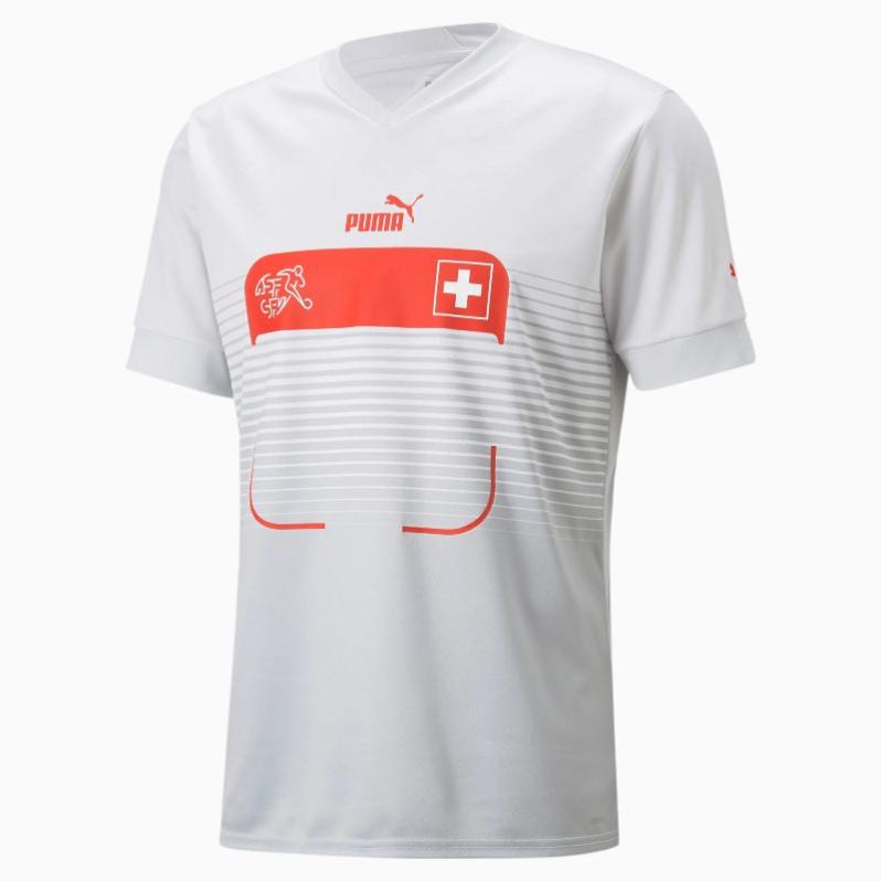
29) Switzerland (Puma)
Look, the Nati has a decent home kit, reinterpreting their look in the Euro 1996. However, the memeable nature of their away kit makes the whole collection sink to the bottom. It's not terrible and not the worst, but the way they overlooked how exposed the jersey would be to the mockery of the masses is enough to deserve this punishment.
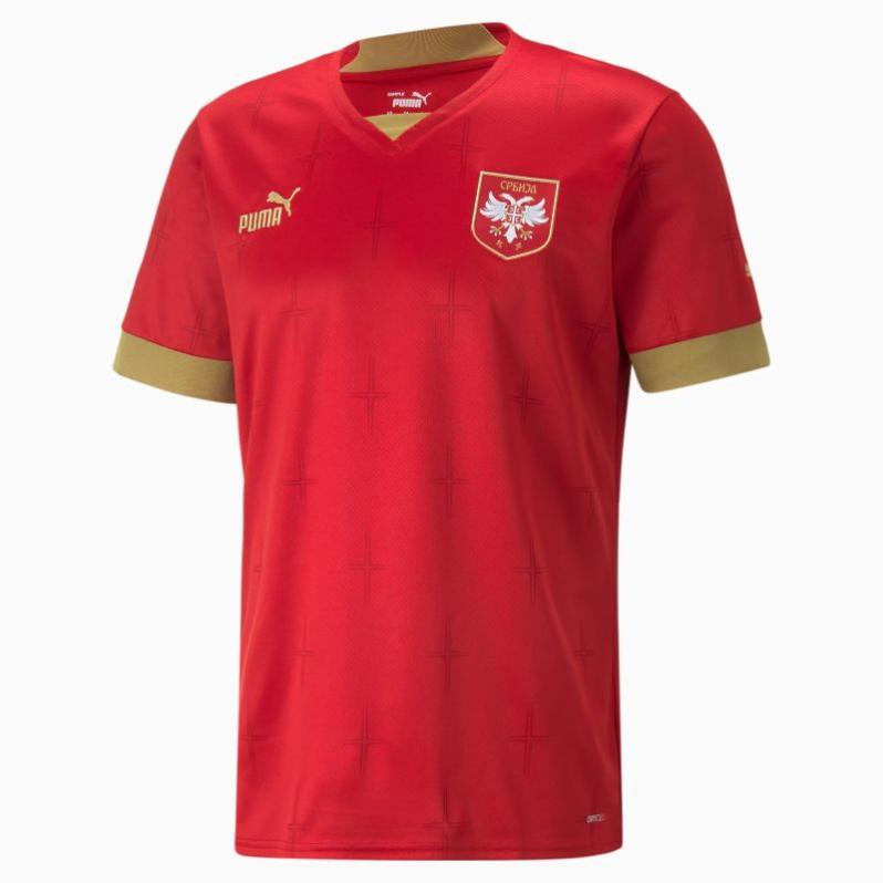
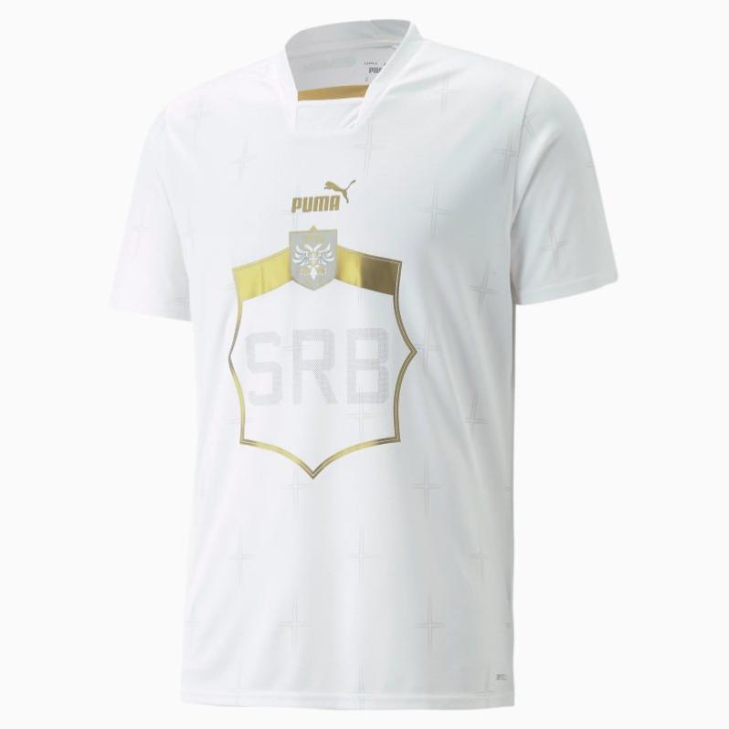
28) Serbia (Puma)
We might have found a new medicine to induce sleep. These Serbia kits don't do justice to the exciting squad heading to Qatar.
In theory, red and gold is not a bad combo, but here it's definitely not catching fuego. And then, there is no real need to talk about the away attire.
Finally, you have the fact that Serbian fans hate them because they don't look Serbian enough or are too similar to how neighboring rivals dress up.
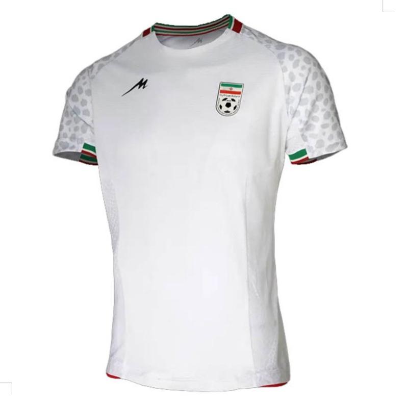
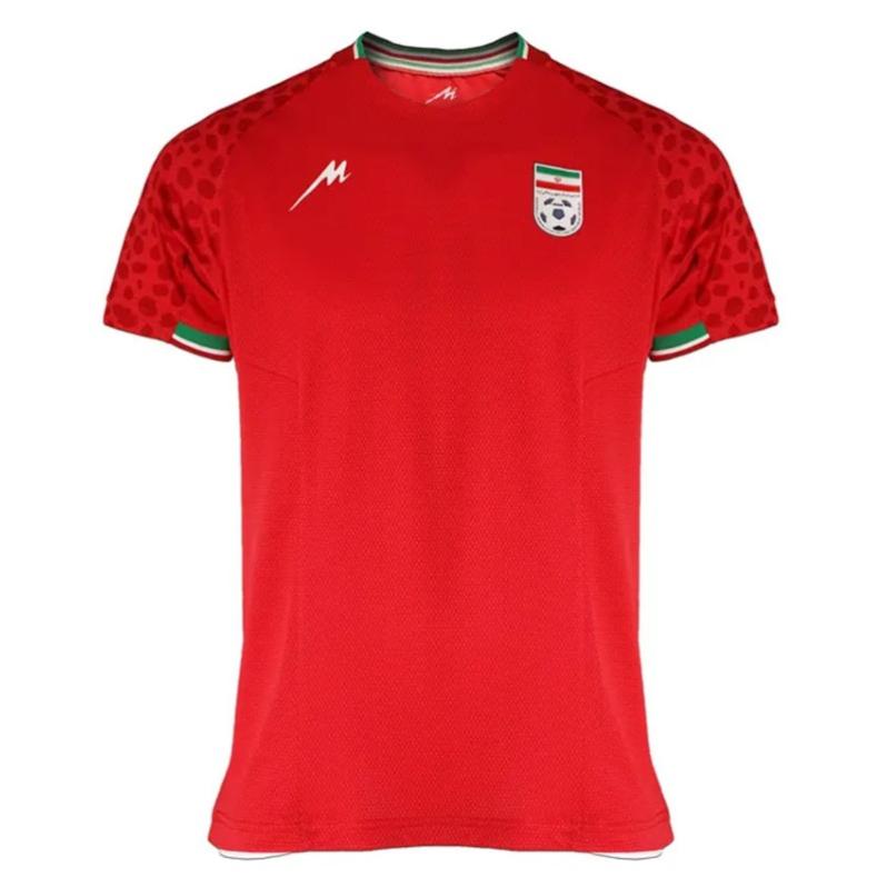
27) Iran (Mejid)
Kudos to Team Melli for trying to promote a local brand and the shout-out to the spotted leopards on the sleeves. However, those designs are not precisely top-notch. They feel rushed.
Besides, having the same graphic in both uniforms looks a little bit cheap.
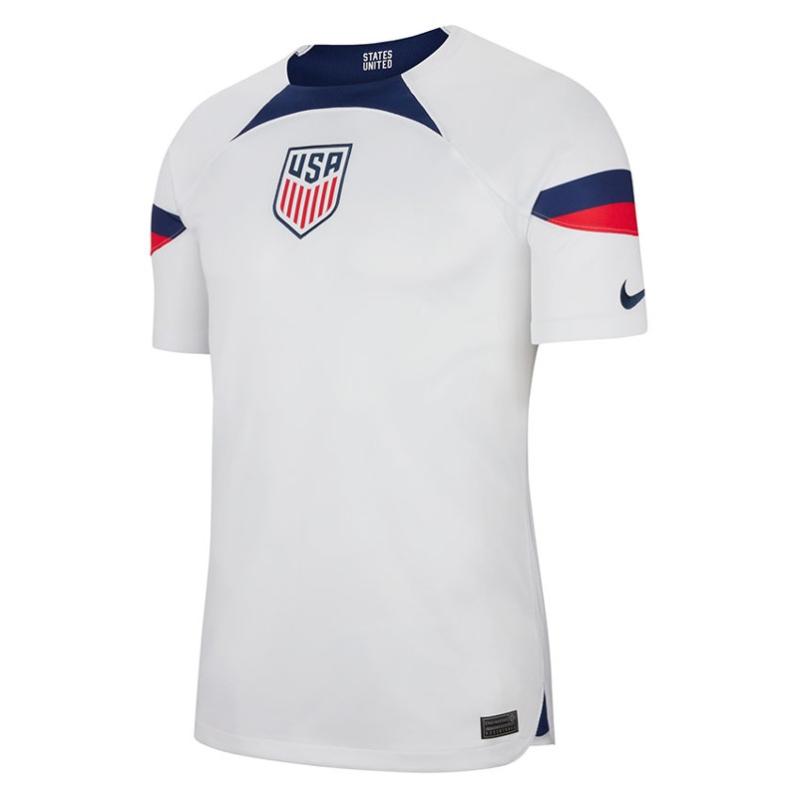
26) United States (Nike)
Unity, diversity and a tribute to other popular sports in the country are nice and exciting concepts to draw inspiration from. But we already know that the idea failed spectacularly in how Nike installed them in the USMNT World Cup jersey.
I mean, they made all those cool buzzwords look boring and dull. Even the players were not happy with the outcome.
The saddest part is that Nike is a U.S.-based brand, so you should have expected more love to the USMNT.

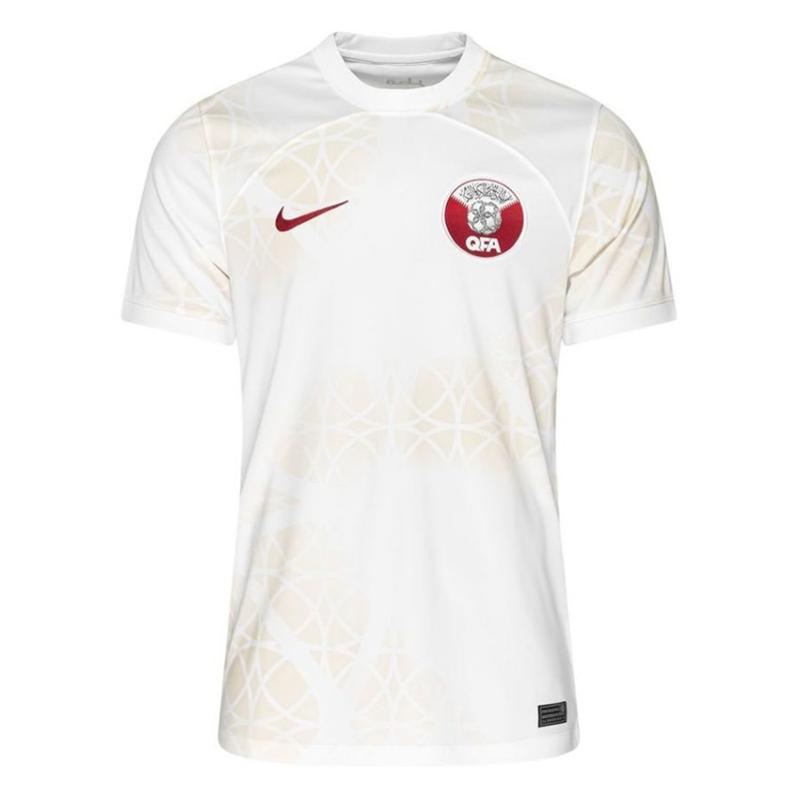
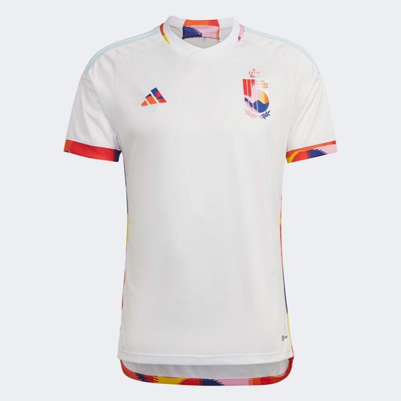
25) Qatar (Nike)
The serrated detail in the cuffs is a cool nod to the Qatari flag, but it's far from being a wow-creator machine. More compelling is the away kit, which presents a graphic inspired by pearls and the sandy coast of the World Cup-hosting nation.

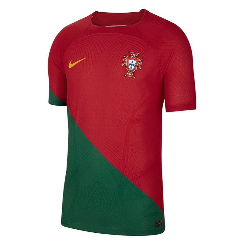
24) Portugal (Nike)
People sometimes say that changes are positive; honestly, we are not sure if this applies to the new Portugal look.
The flag is the inspiration behind the Seleção das Quinas which incorporates a never seen diagonal cut. The concept is to recreate the image of someone who wrapped the national flag over his back. Get it?
Meh, right?
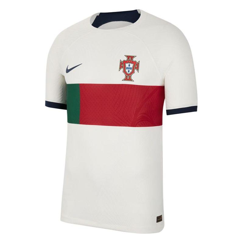
The away kit is ok, but it's not like we haven't ever seen a shirt with a horizontal block blending the national colors
23) Australia
It's one of the WC jerseys that have grown on me after seeing it on the field: Striking yellow with an abstract pattern representing the nation's landscapes and the famous Golden Wattle flower. But still it's 23rd.
The away kit has a color combo inspired by the waters surrounding the country. Yeah, great idea but poor execution.


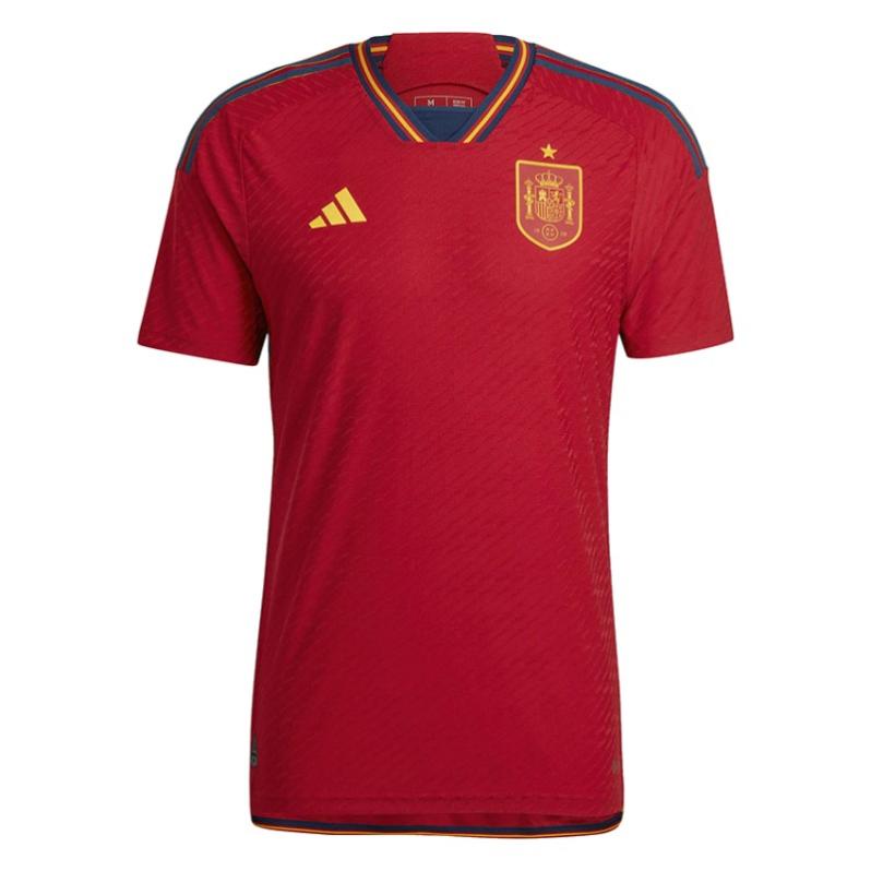
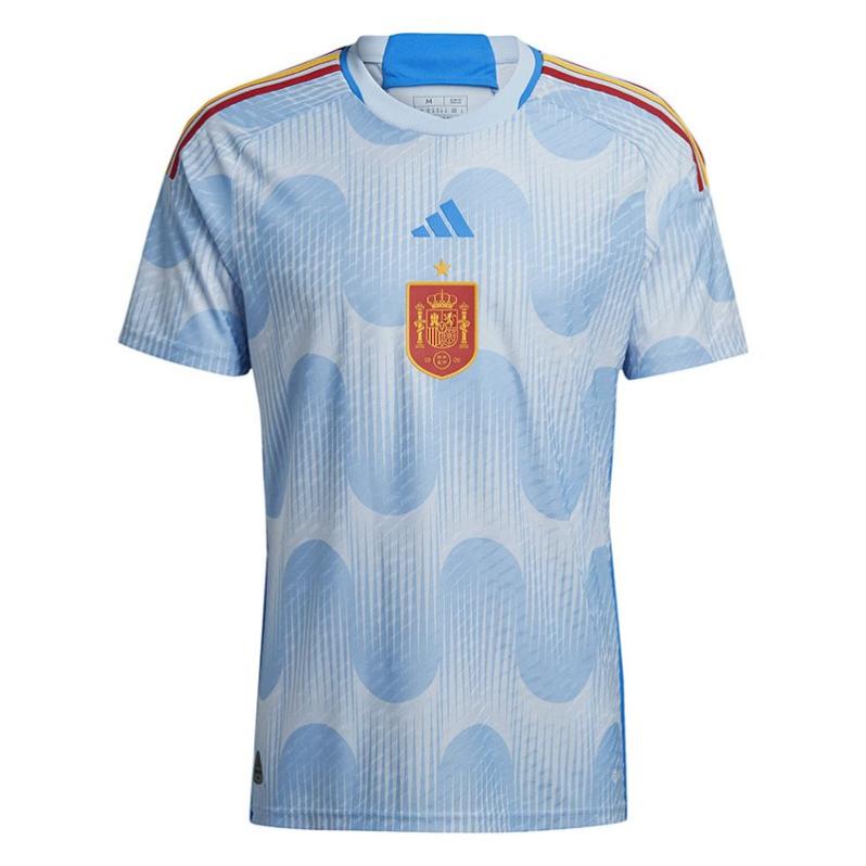
22) Spain (adidas)
No doubts. I dig the simplicity and elegance of the home kit, which gives a vibe similar to the away kit Spain wore when they were crowned world champions in 2010. However, I really don't know what to make about the secondary jersey.
There are days that I think it is god-awful, but some other days I believe it is very clever. The glow-blue and the shapes printed over the fabric, by the way, are an hommage to the art-deco imagery that welcomed the 1982 World Cup in Spain.
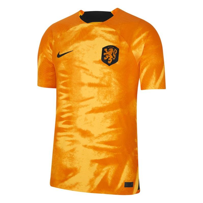
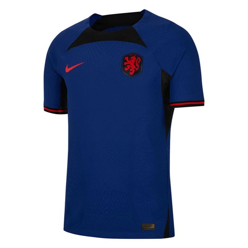
21) Netherlands (Nike)
When you finally see that they were trying to replicate the mane of a lion, some of the tacky tapestries you were visualizing go away. It's not that bad, but sure you have seen better efforts for the Dutch.
The blue-away kit is yet another lousy display of Nike's template for this World Cup.
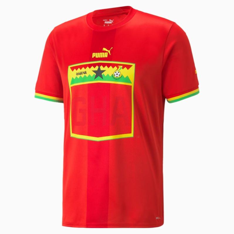
20) Ghana (Puma)
I'll be happy if someone sends me Ghana's home kit as a gift. It has an outstanding balance mixing the national colors in small details like the cuffs with a nod to the team's nickname: The Black Stars.
Sadly, the away kit feels like losing a game at the last minute with an own goal. Not pretty.

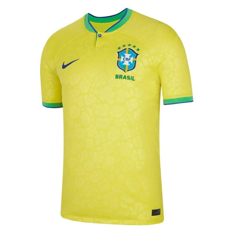
19) Brazil (Nike)
The Amazonian jungle and the jaguar skin are among the elements that inspired the new Brazilian collection. The idea freshens up the classic and iconic verdeamarelha, bringing a solid look.
Not very convinced, though, with the outcome of the away kit. I know a lot of people like it, but in my head, it looks like the wetsuits that 12-year-old kids would wear while practicing bodyboard on the beach.

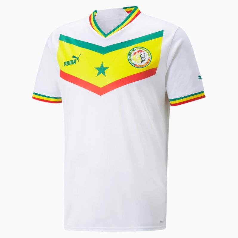
18) Senegal (Puma)
Not bad, right? The home kit brings the national colors in the fabric and pays tribute to the exciting team that reached the quarter-finals in the 2002 World Cup. Of course, the star of the show is that chevron in the middle.
Senegal's badge is also a plus.
The away kit is fine, although it feels a little Cameroonian.
It's a pity we will not see Sadio Mané donning them.

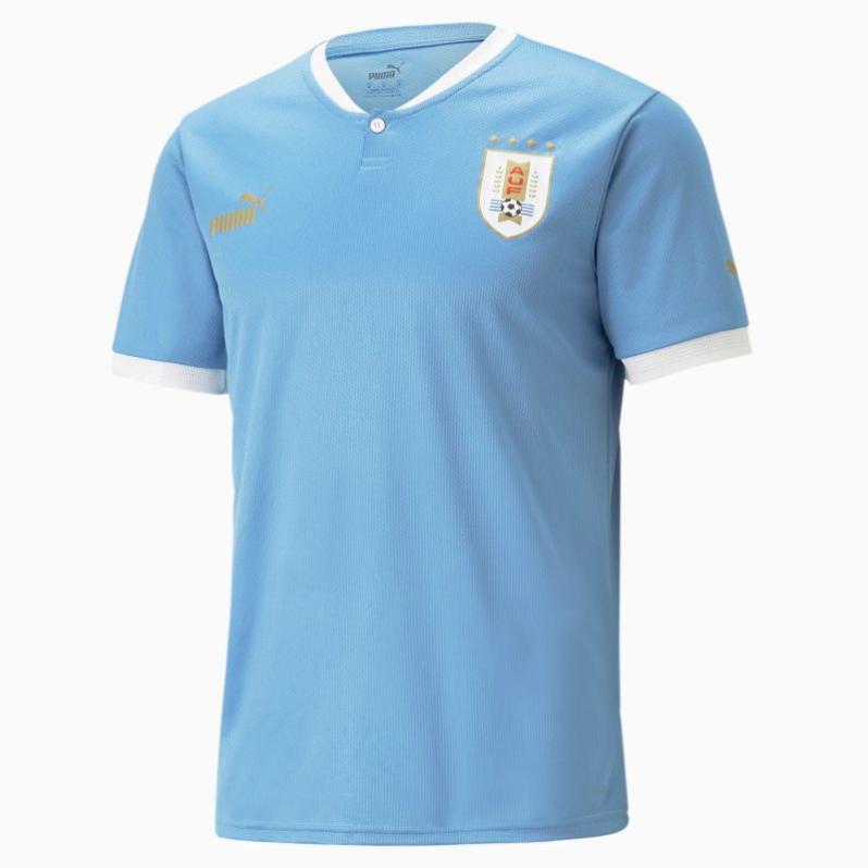
17) Uruguay (Puma)
La Celeste has a beautiful, timeless piece as a home kit for this World Cup. It's not mind-blowing, but that's totally fine. Then, the away jersey is part of the weird Puma template for the tournament and, like the rest of the collection, looks more like a shirt to run a marathon than to play soccer.

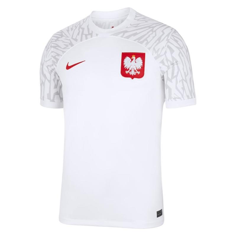
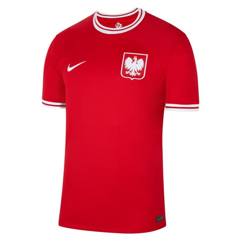
16) Poland (Nike)
Simple doesn't need to be boring and Poland is a good example. The home kit is white, but it throws a good dose of adventure with a graphic over the shoulders and sleeves representing the feathers of an eagle.
The away uniform plays as safe as Czesław Michniewicz's tactics and still manages to turn heads just with some retro details in the neck and cuffs.
15) Morocco (Puma)
Nostalgia is always welcomed and Morocco is in charge of bringing it with a home jersey that reminds us of France 1998. The Atlas Lions got a nod to a classic Puma template from the end of the last century and provided it with a modern twist.
Morocco also has the best jersey among the away collection made by Puma, thanks to a wonderful crown inspired by Moroccan mosaics.


14) Tunisia (Kappa)
OK. I said before that repeating the same design in your home and away shirt is rather cheap. However, I really love the graphic we see in the Tunisia uniforms, which is inspired by a beautiful archeological piece called Ksour Essef cuirass. Some people have attributed the cuirass to the legendary Hannibal, but that version has been largely disputed.
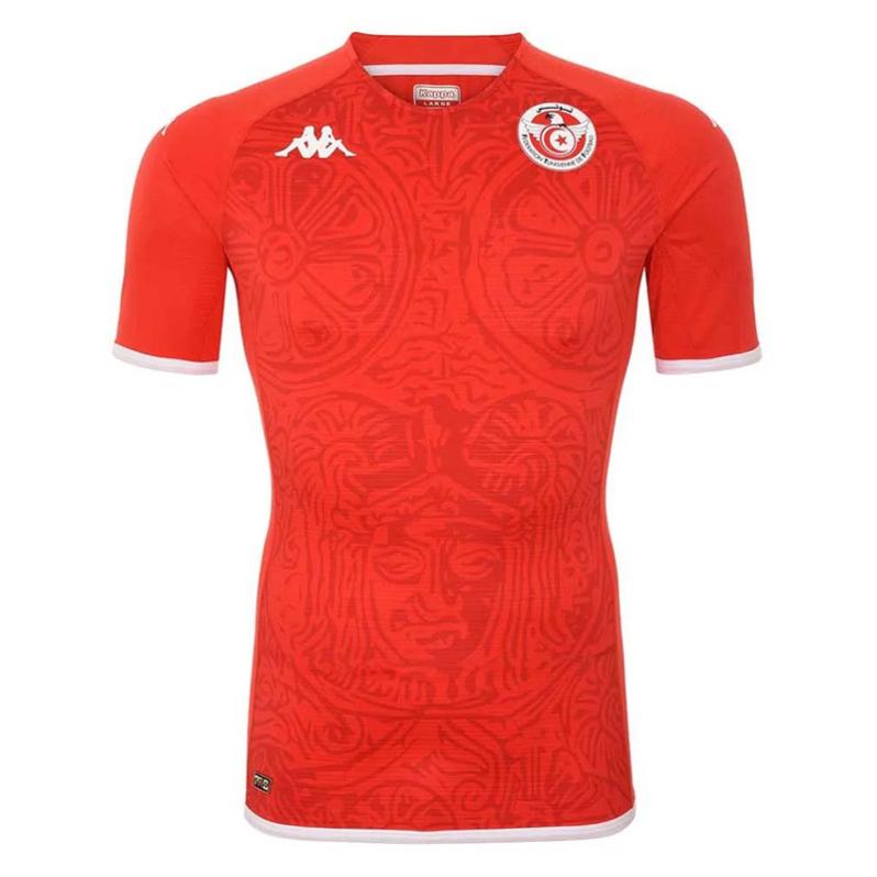
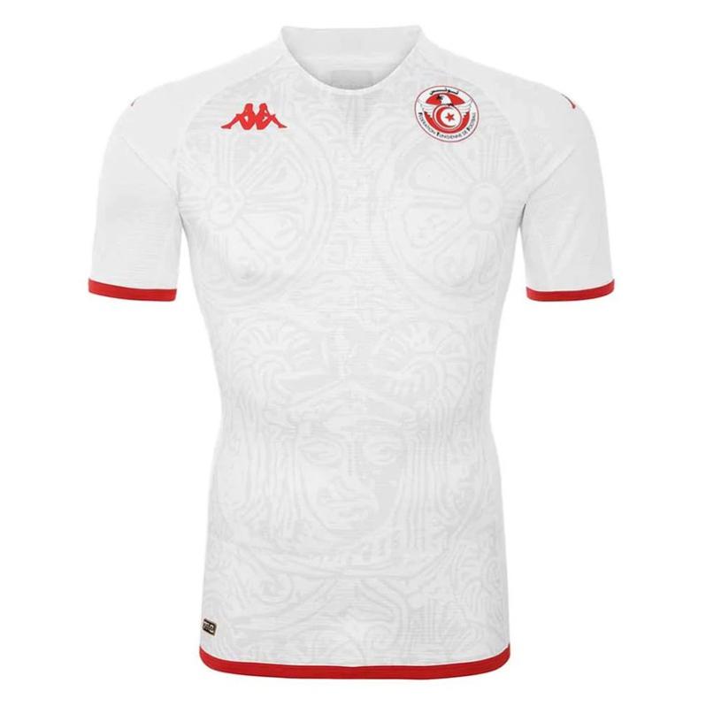
Look, I'm not an expert Historian, so if you want to know more, just google it. Or go to your local library, they will be happy to see you.
View this post on Instagram
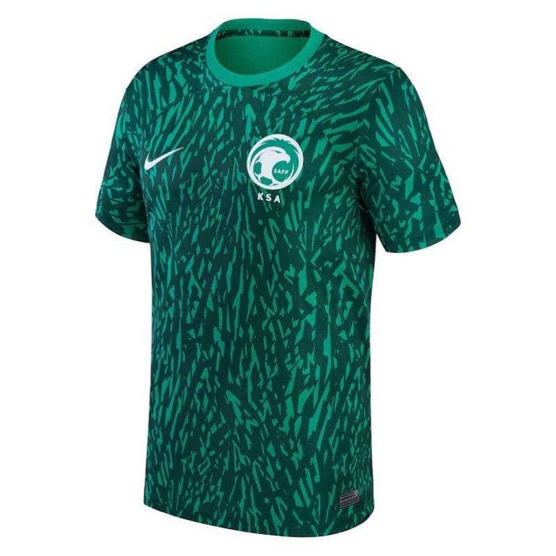
13) Saudi Arabia (Nike)
I see what you did there, Nike. You basically recycle the pattern Saudi Arabia used in the away kit that served the previous cycle and printed it in the home jersey for the World Cup. Sneaky, but we are letting it pass because those palm leaves and falcon feathers look pretty darn good.
The secondary jersey is nice too. Good combination of colors and also an interesting graphic despite the concept representing "speed" and "courage," it's just a pile of marketing bs.

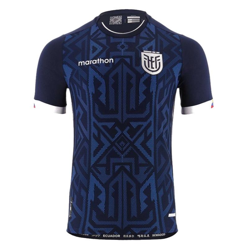
12) Ecuador (Marathon)
That's a pretty solid effort from La Tri. Beautiful, subtle details in the home kit, while the away uniform shines with native motifs over a nice shade of blue in the background
It's a small thing, but loving how they imprinted the name of the country in several languages inside the hem on the waist.

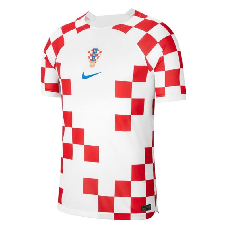
11) Croatia (Nike)
Croatia made an immediate impact when they started playing as an independent country thanks to their talent but also their iconic checkered jerseys. They are donning it again in Qatar, but with a little twist.
Instead of going full chess board, some squares are missing, giving the feeling of an incomplete piece. I was not too fond of it when it was launched, but after some time has been warming my heart.
The same goes for the away kit and its glowing blues.

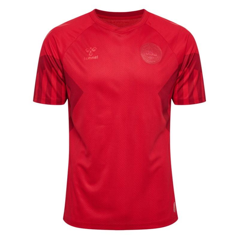
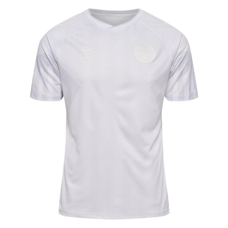
10) Denmark (Hummel)
When the Danish released their WC kits, I wasn't very impressed by the tone-down version of their 1992 Euro-champion jersey and I was thinking of ranking them between 20th-25th place. One week after, however, Hummel explained the exercise was on purpose as a way to protest against all human rights crimes committed by Qatar in preparation for the event and the bump in the list is well deserved.
Not all is about the design, I guess.
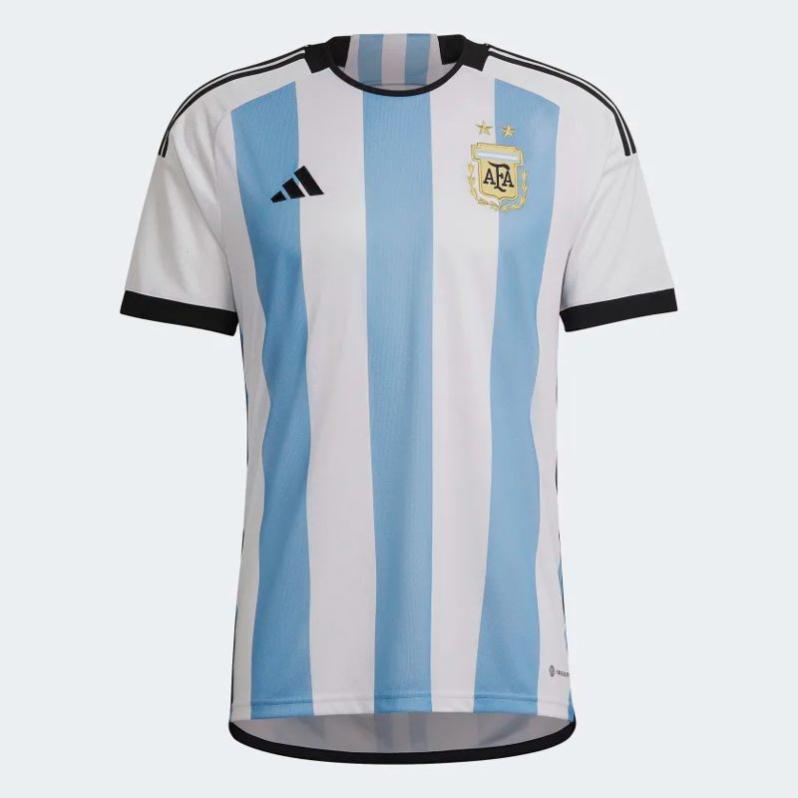
9) Argentina (adidas)
After experimenting with its stripes, Argentina returns to a more classic look. It's a solid attempt, but I'm not crazy about it.
However, what elevates La Albiceleste set is the away kit. The PR is all about how purple is a color that represents gender equality, which is magnificent, but from an aesthetic point of view, the best thing is how el Sol de Mayo (the Sun of May) – a national symbol – is incorporated.
You probably didn't notice it, but the solid purple in the chest is the sun, while the flame-graphic falling toward the waist represents the sun's rays.
Cool.

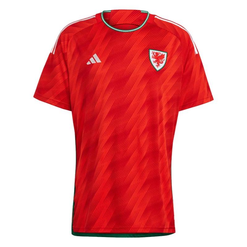
8) Wales (adidas)
That neck in the away jersey is like Gareth Bale scoring a winning bicycle kick. Superb!
Yeah, it's a good idea to have a graphic representing the scales of a dragon in the home jersey, but again, that neck is out of this world.
Did I mention the neck in the away jersey enough?

7) Belgium (adidas)
I know many people think this look is tacky and reminds them of Guy Fieri. But newsflash: the flames in the sleeves make perfect sense with the Red Devils' nickname of the Belgians and the U.S. is not the center of the world, so chances are that not a lot of people outside of this country know about Guy Fieri.
I like it and it reminds me of Japan's flames in France 1998.
The away kit is also a solid effort inspired by the musical festival Tomorrowland, with sparkling beautiful colors in strategic parts of the jersey and the word LOVE on the neck tape.

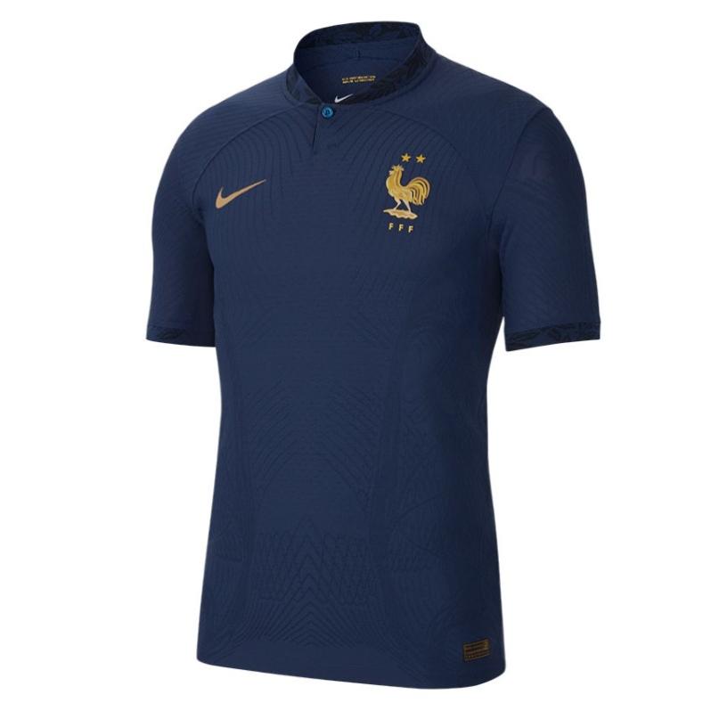
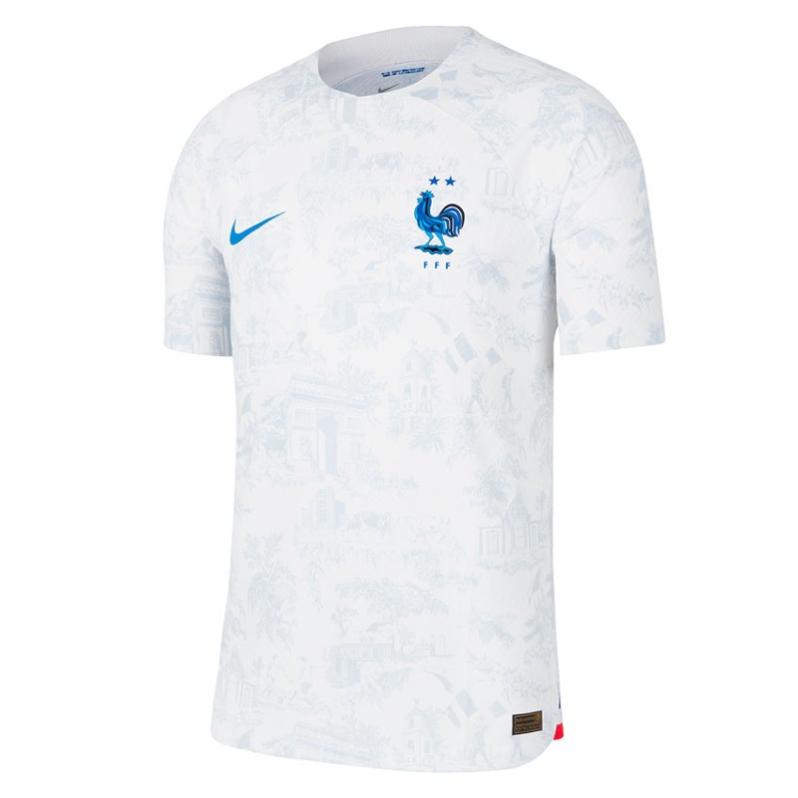
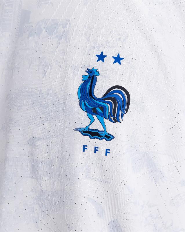
6) France (Nike)
Sometimes you don't need to be flashy to look absolutely cool. And France's home kit is proof of this statement. Navy blue, nice touches of gold and bang!
The away kit is not bad, either. Using the Toile de Jouy textile print as inspiration, the jersey displays several graphics linked to key moments in France's history.
And well, that cockerel in the badge is just oh-là-lá!
r
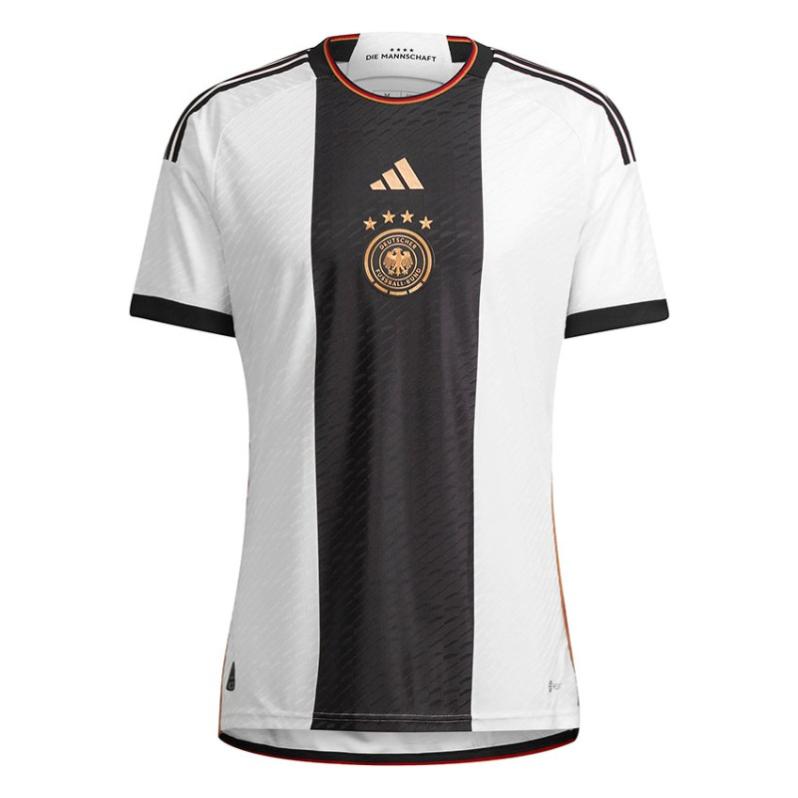
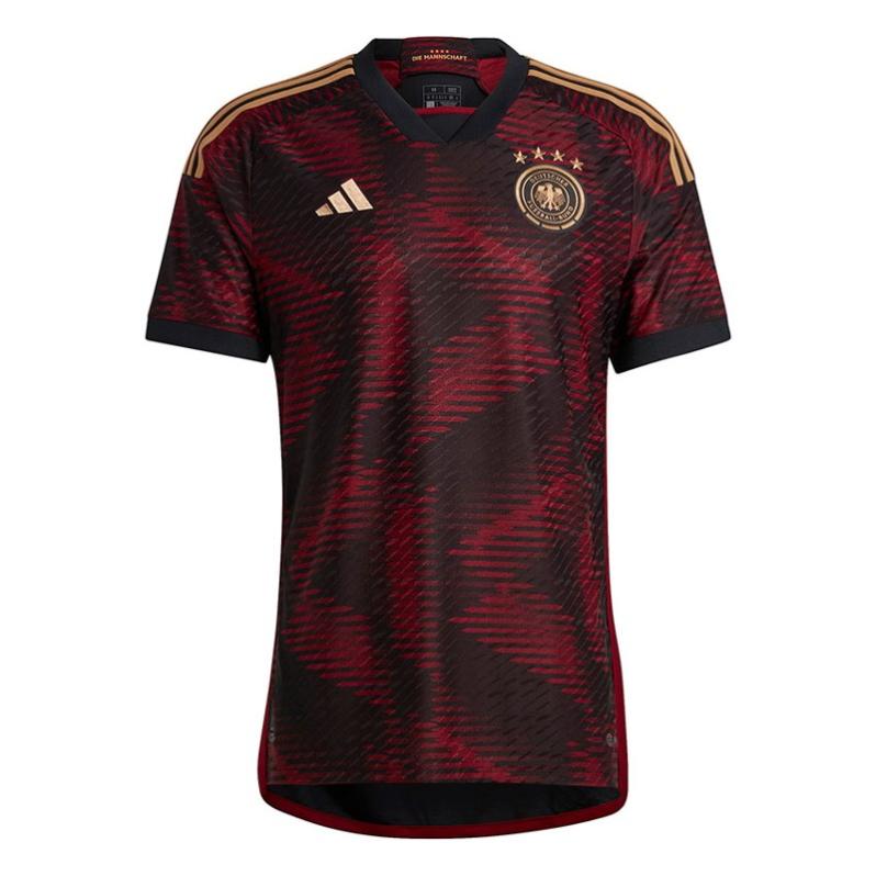
5) Germany (adidas)
adidas always takes good care of Germany and this time is no exception. The home shirt displays a fantastic black stripe with golden details in the center, honoring race cars. Although they don't say it, just imagine a Porsche in a racetrack.
For the away kit, the idea was to blend de D of Deutschland in a mix of red, black and gold. And they do it perfectly.
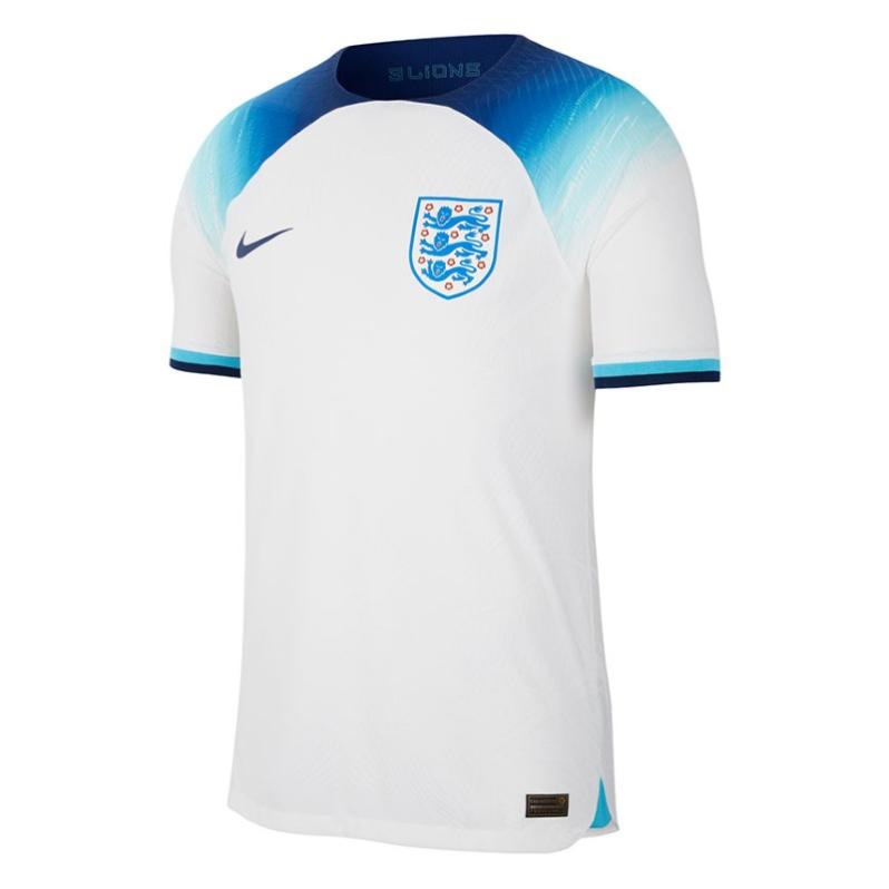
4) England (Nike)
When I saw the first leaks, I thought, "Yikes! What's the plan here? But once the home jersey was released, the feeling changed 180 degrees. The shades of blue and the gradient effect over the shoulders look great.
And then, the away kit is a totally different league. There are no fancy graphics, but a smart and supreme color choice. The combo Challenge Red/Blue Void/Blue Fury, as they call it, is really astonishing.

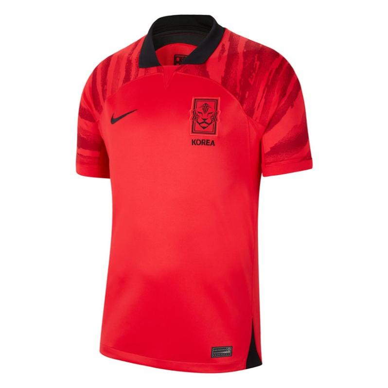
3) South Korea (Nike)
I love the experimental route that South Korea is taking along with Nike. Both looks are fantastic and are linked to national symbols.
The home kit gets a very unique red as well as black tiger stripes over the shoulders. In the case of the away shirt, we see a deconstructed version of the Taegeuk, the circle you see in Korea's flag.
And together, you have dynamite.
;
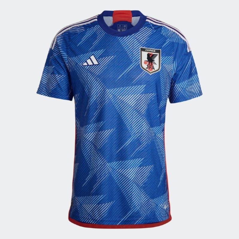
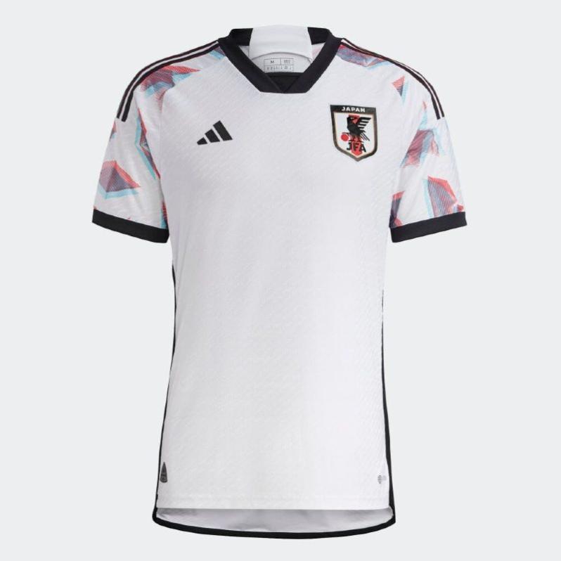
2) Japan (adidas)
Yet another exquisite work from adidas for Japan. The home kit has a beautiful origami-inspired print over blue background on the front. The same pattern adorns the sleeves of the away shirt with an added anaglyph 3D effect.
The outcome is a perfectly balanced collection I would love to receive for Christmas.
1) Mexico (adidas)
The pre-Hispanic motifs and the beautiful cream and cherry combo of the away jersey have basically won the World Cup for Mexico. Single-handed. At least in terms of looks. The home kit inspired by the Quetzalcoatl or feathered serpent is not bad, either.
A great consolation prize in case El Tri doesn't reach el quinto partido.


