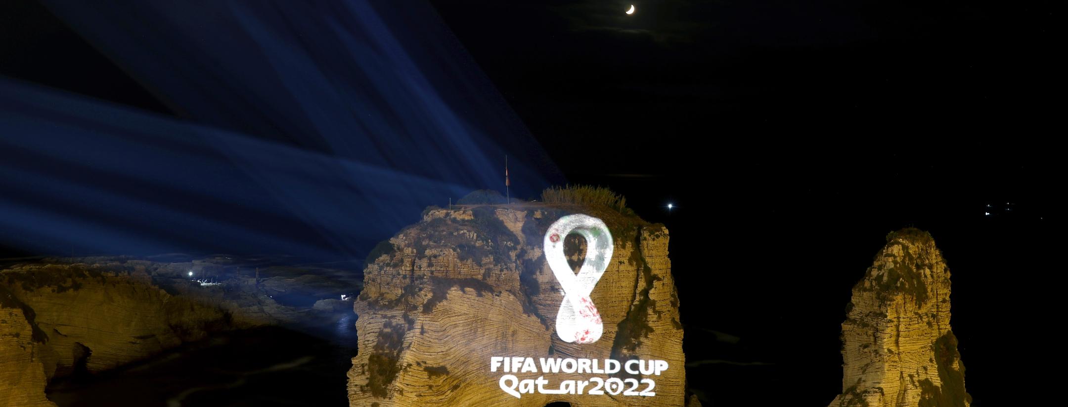
FIFA's unveiling of the 2022 World Cup logo was . . . underwhelming. The unveiling took place in Qatar's capital Doha on Tuesday at around 8:00 p.m. local time, with thousands of spectators watching as the logo was projected on billboards and buildings throughout the city.
Unfortunately, the logo just isn't that exciting. The designers opted to go with a sleek white design, with the emblem resembling a shawl to reflect the fact that the tournament will be held in the wintertime for the first time in its history. While the symbolism here is great and all, it makes for a painfully bland logo, especially when comparing it to the logos of previous years.
Here's the video that was simultaneously released with the unveiling.
The Official Emblem of the 22nd edition of the FIFA #WorldCup was unveiled today as FIFA and host country Qatar reached another major milestone on the road to the world’s greatest football showpiece.
Read more: https://t.co/QLAMYhKPWe pic.twitter.com/5QSPiwRUp0
— FIFA World Cup (@FIFAWorldCup) September 3, 2019
The logo does have some cool smaller details: The swooping curves are supposed to represent the undulations of the Qatari deserts, and the shape of the shawl is also designed to loosely resemble the FIFA World Cup trophy, but personally, I feel like a good logo shouldn't require a mountain of context in order to be appreciated aesthetically.
FIFA World Cup Qatar 2022 Logo Explained#Qatar2022 #FIFAWorldCup pic.twitter.com/FP2cVs2eIa
— World Cup Logo (@WorldCupLogo) September 4, 2019
In my opinion, the largest design flaw was the decision to shape the logo into an "8" in order to reflect the construction of the 8 stadiums in Qatar that were built for the tournament. It's baffling to me that FIFA and Qatar thought it was a good idea to have the symbol of its tournament directly represent the construction of those stadiums, considering said stadiums have cost thousands of migrant-laborers their lives.
The design is also supposed to represent an infinity sign to reflect the universal unity of its fans and participants, which, given what the "8" represents, is deeply ironic as many countries have publicly condemned Qatar for its human rights violations. That being said, while many countries have scolded Qatar, none of them have actually taken any action and decided to boycott the event, so maybe the infinity sign represents the unified complicity every nation is partaking in to participate in this World Cup.
It's funny — in many respects Qatar and FIFA created an emblem that embodies all of the reasons that Qatar shouldn't be hosting the World Cup in the first place, which actually seems quite fitting. The tournament is destined to be marred in controversy, so having a logo that constantly reminds me of FIFA and Qatar's transgressions may just be the guilt trip I need to keep the television off come 2022.


