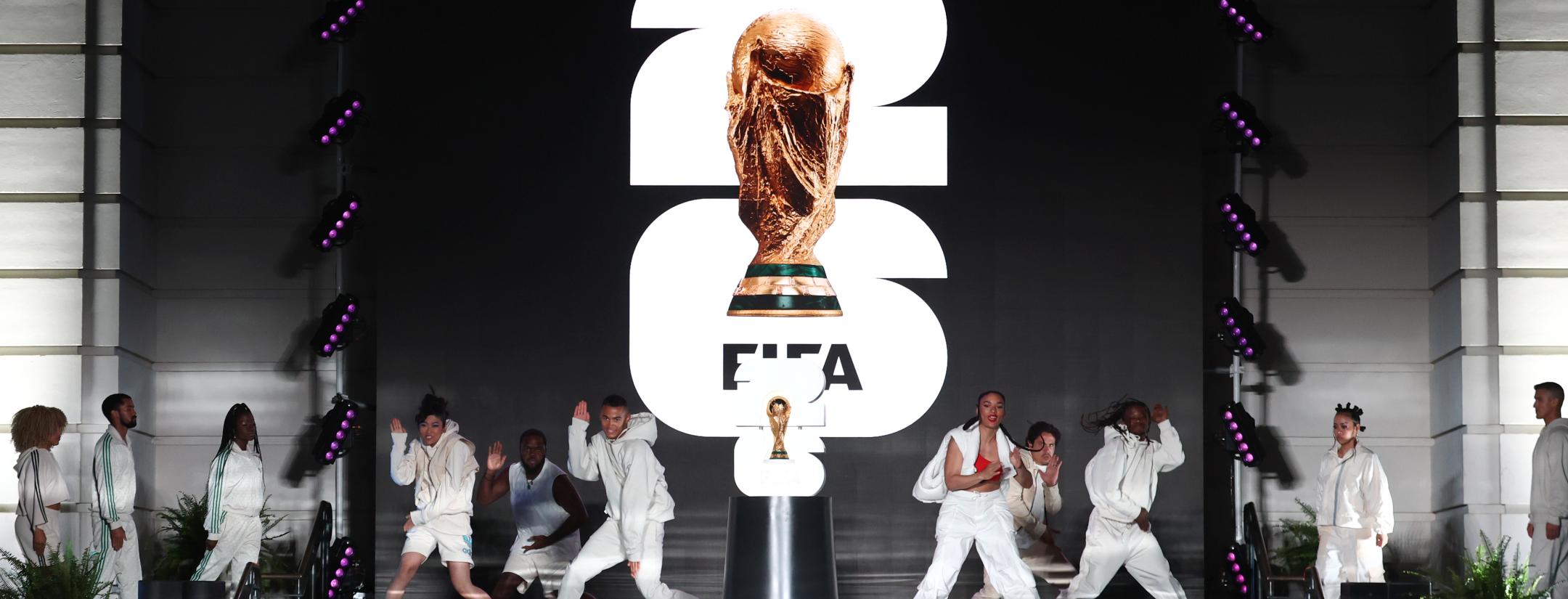
FIFA revealed the official logo for the 2026 World Cup in the United States, Mexico, and Canada on Wednesday night, and the truth cannot be hidden: it is the worst logo in history.
Plain, dull and lacking character, a monstrosity only possible in the soulless minds that run marketing and PR companies, where FIFA is king.
2026 World Cup logo
I mean, look a this:
#WeAre26 pic.twitter.com/H1SyqypUYY
— FIFA World Cup (@FIFAWorldCup) May 18, 2023
Where is the spice? Where is the sass? And most importantly, where are the identities of the United States, México and Canada, the host countries of the tournament?
It's just a big 26 over a bold font with a PNG image of the World Cup trophy, which I – ignorant regarding design production – could have done in Canva. No offense, Canva. I love you.
FIFA says, "It's inclusive branding, simple and highly customizable. It's a logo that can easily be transferred and used across merchandise, and there will be unique color patterns and slogans for each host city."
Like this:
Welcome World #WeAreDallas where BIG energy fuels the beautiful game ⚽ #WeAre26 l #FIFAWorldCup pic.twitter.com/ckmQHbu0zD
— FIFA World Cup 2026 Dallas™ (@FWC26Dallas) May 18, 2023
But again, there is no character. How are people going to create fond memories of whatever they have done here?
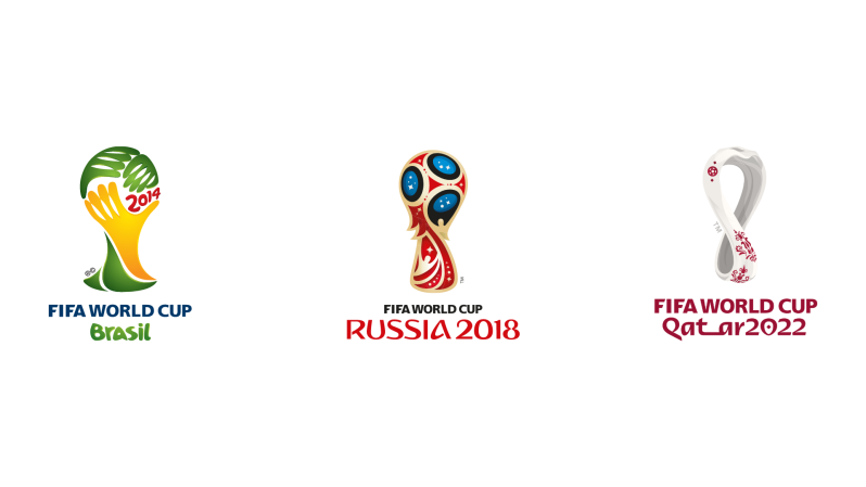
The sad part is FIFA has been leading us to this point for decades. Although they were now in perspective gorgeous artistic representations, the silhouette of the trophy has been there, uninterrupted, in all the World Cup logos since Brazil 2014.
And let's not even talk about the stadiums. Watch any game from Korea-Japan 2002 to date, and you'll feel all the matches have been played in the same venue.
Yes, FIFA has been standardizing the World Cup under your nose the way phones, airports, hotels, food chains, and SUVs make you think everything is the same no matter where you live. And that's sad and depressive and makes you miss even more the logos of past World Cups played in the region.
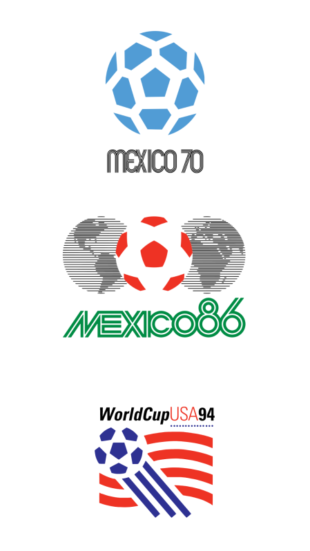
Look how beautiful the official imageries of México 1970, México 1986 and USA 1994 were.
Life is not fair.
FIFA, I hate you.


