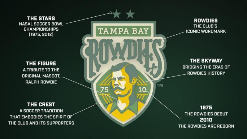
As with many things to come out of Florida, the Tampa Bay Rowdies do things a little differently than the rest of the country. Ahead of the 2021 USL Championship season, the club dropped a new Tampa Bay Rowdies crest that is quintessential Florida, in the best way possible.
The Rowdies, who have been around in some form since 1975, unveiled their rowdiest crest yet, prominently featuring a reimagined Ralph Rowdie, a relic of 1970s sports design and prototypical Florida Man.
2021 Tampa Bay Rowdies Crest

New Tampa Bay Rowdies crest. Photo: @TampaBayRowdies | Twitter
It's the 'stache for me.#TogetherRowdies
— Tampa Bay Rowdies (@TampaBayRowdies) April 23, 2021
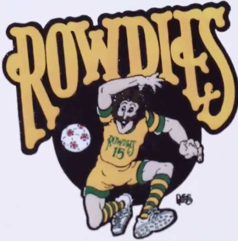
Created in conjunction with the Tampa Bay Rays’ creative team, the new Rowdies crest is certainly iconic. Ralph Rowdie was the team’s original mascot back in the 1970s in the NASL, a boisterous, mustachioed figure. In the new logo, he’s redesigned to look like a founder of the game from late 1800s England.

The original Ralph Rowdie. Photo: @TampaBayRowdies | Twitter
The crest is all about celebrating the past for the Rowdies, who have their share of history (by American standards). Originally founded in 1975 to compete in the NASL, the Rowdies won the Soccer Bowl (yes, that’s what they called the championship back then) in their first season. After the NASL folded, the Rowdies continued to compete in various other leagues, including indoor soccer, before eventually closing up shop in 1993. In part due to the Rowdies’ success, MLS gave Tampa one of the original 10 franchises, though the Tampa Bay Mutiny were contracted five years after the league began play.
The Rowdies were reformed in 2010, initially playing in the reformed NASL and winning another NASL title in 2012. Tampa Bay now plays in the USL Championship, which begins its season on Saturday (the Rowdies’ opener is May 1).
Thus, you get the 7510 number that is prominent on the new Tampa Bay Rowdies crest, noting the birth and rebirth of the franchise. And the two stars on top of the team name represent the two NASL titles, which seems like a stretch but remember this is Florida.
Hear more about the inspiration and process behind designing the new Rowdies crest.#TogetherRowdies pic.twitter.com/Le82wNgNDh
— Tampa Bay Rowdies (@TampaBayRowdies) April 23, 2021
The Rowdies also unveiled three new uniforms for the 2021 season on Friday, one of which features the new crest. The 7510, Legacy and Volt kits all have their own looks, but all scream “lower-tier club trying to make a buck.” Not that there’s anything wrong with that, because the kits do look like a lot of fun.
New Season. New Drip #TogetherRowdies pic.twitter.com/9zUbBjN0pv
— Tampa Bay Rowdies (@TampaBayRowdies) April 23, 2021
Personally, I love the new Tampa Bay Rowdies crest. It’s weird and different, which is what you need when you’re in the second division and looking to make a splash. But it also points to history, which most soccer clubs in the U.S. don’t have yet.


