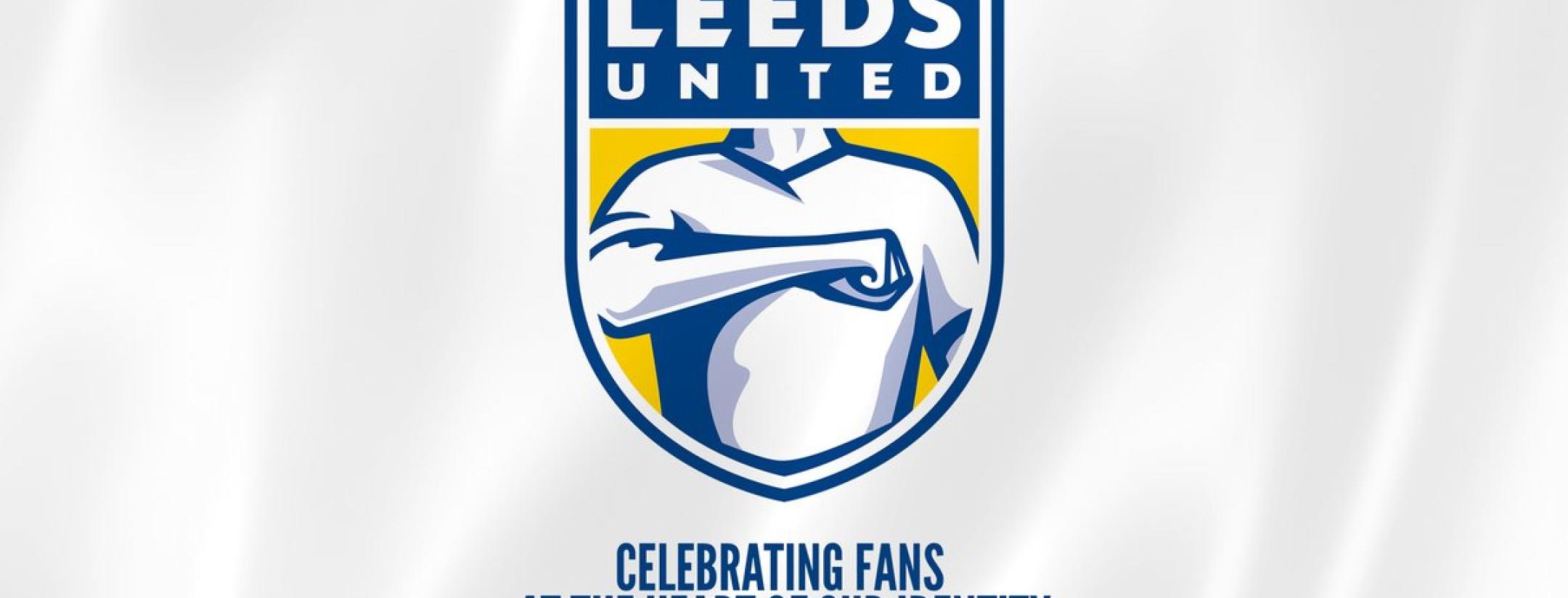
Leeds United, nearing its 100-year anniversary, spent six months and consulted 10,000 people in designing a new club crest. The three-time champions of England, currently in the second-tier Championship, unveiled the logo on Wednesday with a proud Twitter proclamation. The reaction to the Leeds United crest was not kind.
We all know the internet can be a wicked place. From Facebook trolls to presidential tweets, no one is safe. But sometimes wickedness hits just the right note. Such was the case for the reaction to the new Leeds United crest, which is just, well, see for yourself.
6 months of research
10,000 people consulted
Ready for the next 100 yearsWatch video https://t.co/rIIdL2Yz9F pic.twitter.com/pMrd3zTjCl
— Leeds United (@LUFC) January 24, 2018
The fact there are more replies than likes or retweets gives the first glimpse into the temperament of the reaction to the Leeds United crest. Simply put: It was not kind.
Almost immediately people began taking a collective dump on the shield, which, to be honest, is a pretty poorly designed piece of work. Aside from the Leeds United on top, it looks like a generic crest a team might be given in a video game as a placeholder.
As a Leeds fan, I've been through a lot. I stuck by them after they sold star players. Through relegation to the Championship. Through bankruptcy. Through relegation to League One. Through the nightmare leadership of Massimo Cellino. But this new crest could be the final straw!!!
— Ryan Lailvaux (@RyanLailvaux) January 24, 2018
I am actually speechless, what a mockery this makes of our club #LUFC
— Tom Dunne (@lufcdunny98) January 24, 2018
Delete club. Start again
— Comrade Mumford (@sammy_mumford) January 24, 2018
A badge sooooo shit even the guy depicted is hiding the badge with his hand!
Give up #leeds. You were a great club once, now a global laughing stock.#lufc #MOT #lufcbadge pic.twitter.com/6lfoEHoM8O— MK Efendi (@M0Skhan) January 24, 2018
Most offensive jumper I’ve seen him wear pic.twitter.com/bAAFwAHjd3
— Samuel (@samuelh__) January 24, 2018
It’s wank. If that’s staying for a 100 years that’s generations of my family not having anything Leeds United related. @TUFC1899 how much are your shirts am swapping teams
— lewis (@lew_longthorn) January 24, 2018
This is a bad dream, wake me up when it's over
— Adam Bilyj (@adambilyj) January 24, 2018
Is this a joke? @andrearadri this is awful!!!!!!!!!!
— Bethany Sherrard (@BethanySherrard) January 24, 2018
— Baz (@baz9torres) January 24, 2018
Pretty sure it was Stevie Wonder
— Clark Bradley (@c_larkbradley) January 24, 2018
— Mr Geldard (@MrJGeldard) January 24, 2018
It didn’t take long for people to create new versions of the logo. Note this tweet has far more likes than the original Leeds United tweet.
Took them 6 months, this took me 6mins at Work and it’s already improved #LUFC #MOT pic.twitter.com/Hd3HS8kCrj
— Kieran Robinson (@KieranJRobinson) January 24, 2018
Absolute laughing stock today. Look at this.. pic.twitter.com/u1Du4v3Cz0
— CJ (@CharlieJJones) January 24, 2018
Tried to take the American badge theme and improved it for u, who do I invoice! pic.twitter.com/zRN9odyqGr
— dominik robbins (@captainiow) January 24, 2018
— Steve (@5teveleach) January 24, 2018
— Just M1ke (@JustM1kePlays) January 24, 2018
Donald Trump would be proud of this one.
— CJ (@CharlieJJones) January 24, 2018
One fan cleaned it up a bit.
#leeds #lufc #lufcbadge #mrclean pic.twitter.com/5I7sj1wgV4
— michael smyth (@wheresgrandad) January 24, 2018
Some decided it was too awful for one club to hog.
— Ol C (@OClO52) January 24, 2018
I get it lads. I get it. It's the future. pic.twitter.com/EtklECgQT6
— Drawty Devil (@DrawtyDevil) January 24, 2018
If you can't beat em ..... @Ed_DawesBeeb @OwenBradley @_omeara_r @tweddytwedds @redfern_ian @dcfcofficial @LUFC pic.twitter.com/DELTA8cviJ
— Roger Everill (@EverillRoger) January 24, 2018
Before the end of the day, Leeds United was reportedly looking at rethinking its new badge. Let's hope it doesn't take six more months to turn out something like this.


