Liga MX Clausura 2023 starts in less than a month and some teams are already presenting their jerseys for the tournament. Among those clubs are the current champion Pachuca, as well as Atlas, León, Querétaro, Santos Laguna and Xolos.
All six are sponsored by the Mexican company Charly Futbol which decided to present a unified collection inspired by the traditional nahual and tonas figures created by Oaxacan artisans from the well-known Jacobo and María Ángeles workshop.
Te presentamos #ArteyFutbol la nueva Edición Especial de Jerseys Alternos 22/23.
Una colección de @charlymxoficial y @charlyfutbol
inspirada en las obras de #JacoboyMariaAngeles
Disponibles en https://t.co/ioeed4rHOK y en Tiendas CHARLY. pic.twitter.com/LMNVFFdvPX— CHARLY Fútbol (@CharlyFutbol) December 7, 2022
A literal work of art.
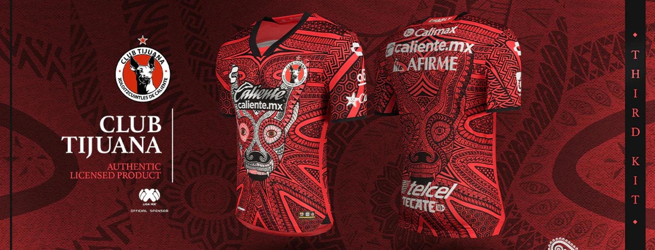
Charly Fútbol Third Jerseys Liga MX 2023
A nahual is a human being able to shapeshift and become an animal (tona) to unlock some sort of spiritual awesomeness. And that's why you see the silhouette of some animals printed over the sublime graphic adorning the shirts.
Every animal, of course, is intimately related to the team donning them.
The champion Pachuca, for example, pays tribute to the tuzo, a type of mole common in the state of Hidalgo and the reason behind their nickname.
Arte, pasión y tradición que se lleva en el escudo del actual campeón @Tuzos, sin olvidar su séptima estrella obtenida. 7️⃣⭐️
Ésta es la inspiración del nuevo Jersey Pachuca Alterno 22/23. @CharlyMxOfi | #ArteyFutbol | #PachucaSomosTodos | #JacoboyMariaAngeles pic.twitter.com/s2jNGnngz8— CHARLY Fútbol (@CharlyFutbol) December 7, 2022
Atlas's animal is a fox, which is also one of the ways people refer to them.
En esta ocasión la nueva piel de los Rojinegros está llena de magia, triunfos e historia.
Siendo ésta un reflejo de su carácter y valentía que presentan cada vez que salta a la cancha el @AtlasFC. ⚫️@CharlyMxOfi | #ArteyFutbol | #SomosMásRojinegros | #JacoboyMariaAngeles pic.twitter.com/Vc7zQs5shC
— CHARLY Fútbol (@CharlyFutbol) December 7, 2022
Club León? No, it's not an antelope. Of course the image corresponds to the biggest cat on the planet.
Te presentamos el nuevo Jersey León Alterno 22/23, una fascinante camiseta que refleja fantasía, cultura y pasión por la cancha. @clubleonfc ⚽
Una obra de #JacoboyMariaAngeles
@CharlyMxOfi | #CHARLYFútbol | #ArteyFutbol
| #SerFieraEsUnOrgullo pic.twitter.com/69bOGypJUW— CHARLY Fútbol (@CharlyFutbol) December 7, 2022
Querétaro leans in their Gallos Blancos moniker with the phenomenal print of a rooster.
Un verdadero gallo jamás se rinde. ⚫️
Resaltando con su cresta y colores; haciendo de esta prenda, un plumaje único que canta el orgullo de ser de Gallos Blancos del @Club_Queretaro.
@CharlyMxOfi | #CHARLYFútbol | #ArteyFutbol | #SiempreGallos #JacoboyMariaAngeles pic.twitter.com/P0CvlpNTu1— CHARLY Fútbol (@CharlyFutbol) December 7, 2022
My personal favorite is Club Tijuana and the fantastic face of the unique Xoloitzcuintle dog that the team uses to identify themselves.
Nueva piel jamás antes vista.
Una mezcla que define al místico “Xoloitzcuintle”: Pasión, coraje y valentía⚽
Siendo una pieza única, como su afición, @Xolos. Una obra de #JacoboyMariaAngeles
@CharlyMxOfi | #CHARLYFútbol | #ArteyFutbol | #TijuanaRojinegra ⚫ pic.twitter.com/MGMuzsVp3z— CHARLY Fútbol (@CharlyFutbol) December 7, 2022
The only club not using an animal is Santos Laguna, which goes for a native warrior that represents their Guerreros nickname.
La esencia de un Guerrero también se lleva en la piel a través del arte; un espíritu fuerte y valiente. @ClubSantos ⚔️
Arte realizado por #JacoboyMariaAngeles
@CharlyMxOfi | #ArteyFútbol | #ModoGuerrero⚔️ pic.twitter.com/9ukpHVf4Th— CHARLY Fútbol (@CharlyFutbol) December 7, 2022
In general, I think the job is fresh and exceptional. It has an identity and escapes from boring, traditional soccer jersey design. But at the same time, I understand the hard time some fans are giving it.
Sure, some picky supporters absurdly complain that Club León's tone of green is not the classic emerald green, not considering that it's a third jersey and not the main one. However, we can all agree that the number of sponsors is almost worse than a NASCAR uniform.
And yeah, we saw that Cementos Fortaleza finally agreed to change its colors to keep the "chromatic harmony" of the designs, but it's still a punch in the face.


