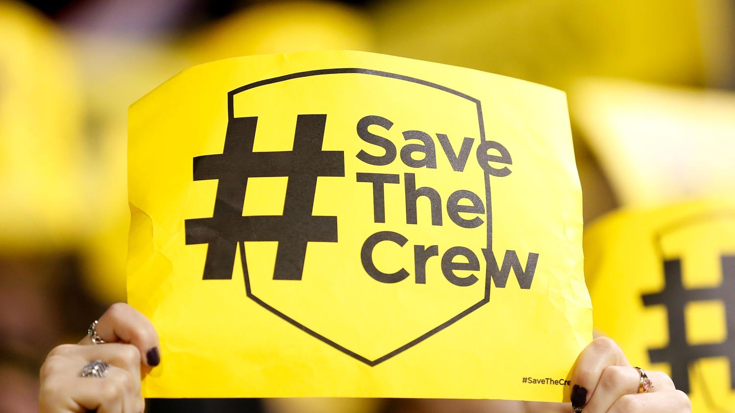
In 2018 the soccer fans of Columbus banded together to achieve an incredible feat and prevented their beloved Crew from being moved to Austin, Texas. The #SaveTheCrew movement demonstrated the power of Major League Soccer fans, especially in Columbus.
On May 10, a logo rebrand — reminiscent of a hockey stick — that dropped the “Crew” name severely rubbed the fans of Columbus the wrong way. Columbus SC would be the new name of the club and “The Crew” would only be a nickname going forward. The new logo stinking more than a trash can filled with rainwater and dog droppings on a hot summer day didn’t help matters either.
In addition to the lackluster logo, the club’s rebranding and dropping of “The Crew” was done without the input of The Nordecke, Columbus’ supporters group.
The rebranding drama was big enough for Taylor Twellman to go on one of his infamous rants. Love him or hate him, he’s a polarizing voice in the soccer sphere.
A week of anger and frustration from Crew supporters culminated in an important discussion between the club and the fans. On Monday evening, the club released a statement saying the team will be called the Columbus Crew from now on.
Joint statement from the Columbus Crew and its supporters group, @Nordecke.#Crew96 pic.twitter.com/S0o8KeWkAV
— The Crew (@ColumbusCrew) May 18, 2021
The Columbus Crew followed the statement up with reaction videos from owners Dee Haslam and Peter Edwards along with fans who were involved in the discussion.
Columbus Crew.
Forever. #Crew96 pic.twitter.com/oImRB4tFH5— The Crew (@ColumbusCrew) May 18, 2021
@Nordecke#Crew96 pic.twitter.com/cfbbXNKzg1
— The Crew (@ColumbusCrew) May 18, 2021
Proud to be your club, #Crew96 supporters. pic.twitter.com/RVfNSKs8z1
— The Crew (@ColumbusCrew) May 18, 2021
Amazing how communication solves issues. I personally am a big fan of dropping the “SC,” but that’s just me. The updated logo has yet to be released. For now, it appears the club will stick with the Ohio flag design with a wonky looking “C” in the middle.
Here’s a rough idea of what the updated logo could look like.
Not great at photoshop, but heres a look at what the reworked logo could look like pic.twitter.com/Cl5dGCjjJS
(Follower limit) (@SexIandCAVS) May 18, 2021
At least “Crew” and the “96” will be included. Plenty of fans are still upset about the logo change. One fan who I feel deserves some recognition is a Twitter user by the name Crich19. I have no idea who this person is, but they have created a slew of concept logos with some of them being absolutely fantastic.
Dear Crich19, I’m not sure if you’ll ever read this, but I hope you find a career in graphic design because you make some great work.
— Crich19 (@Crich191) May 18, 2021
@Nordecke With zero design background and using free online software, I think I just came up with something that represents a “C” and the Ohio flag better than a design company. Point is that we deserve better! #SaveTheCrewAgain #WeAreTheCrew #Crew96 pic.twitter.com/ZUKB5HH5i5
— Crich19 (@Crich191) May 12, 2021
@DegenerateTBone We should just combine all 3 logos #SaveTheCrewAgain #WeAreTheCrew #Crew96 pic.twitter.com/GKMyYMob9p
— Crich19 (@Crich191) May 12, 2021
This is good stuff. I’d definitely drop the “SC”. Also, I think you may be onto something more by not outlining the name, like this... pic.twitter.com/gytnI7Vvya
— Crich19 (@Crich191) May 18, 2021
I made a C pic.twitter.com/WkfUhEYWfS
— Crich19 (@Crich191) May 18, 2021
@Nordecke Now that we’re the Crew again, here’s another logo design. I edited the existing to have 2 C’s and positioned the stars around the circle like the Ohio flag. #Crew96 pic.twitter.com/z9wqArkeFZ
— Crich19 (@Crich191) May 18, 2021

 Home
Home
