The biggest news of the Major League Soccer offseason so far has been the Chicago Fire’s new logo. For many, it was a bigger shock to the system than seeing Giovani dos Santos score goals for Club América.
Named for the greatest story our city can tell - its own legend.
@grahamparkerfc https://t.co/zVr2cWbs0d
— Chicago Fire FC (@ChicagoFire) November 21, 2019
Chicago isn’t the first to take on a new visual identity that’s modernized (cleaner, simpler and more of a brand as opposed to a traditional football crest). In recent times the likes of Juventus, Atlético Madrid and West Ham have made similar changes, albeit to varying extremes.
Having said that, amendments and total overhauls to badges are applicable to almost every club around the world — especially those that trace their origin back over 100 years. Because of that fact, some great (or at least interesting) crests have been abandoned to the fog of fading memory.
Here are 25 historical badges that I’m pretty fond of for whatever reason.
25 Old School Badges That I'd Like To Put On A Hat
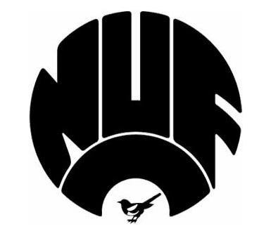
1. Newcastle United | 1983-1988
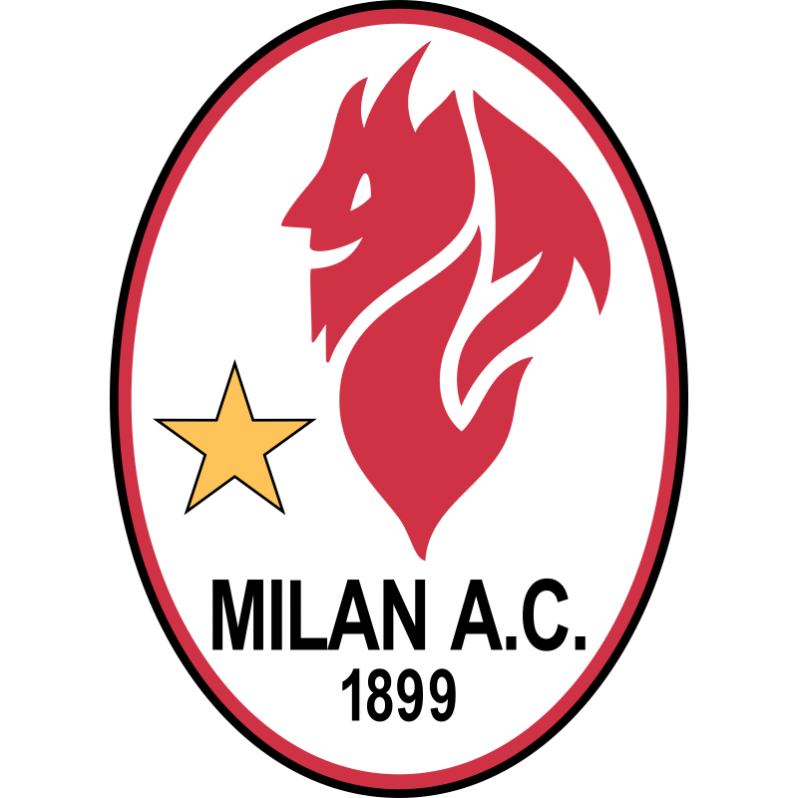
2. AC Milan | 1980-1982
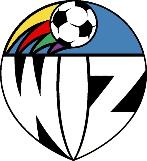
3. Sporting Kansas City | 1996
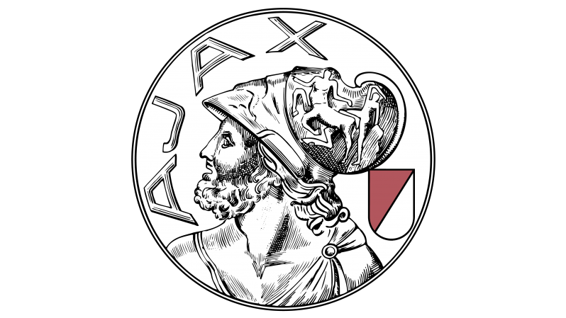
4. Ajax | 1928
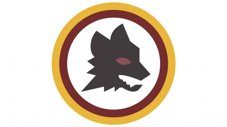
5. AS Roma | 1977
6. Sevilla | 1918-1921

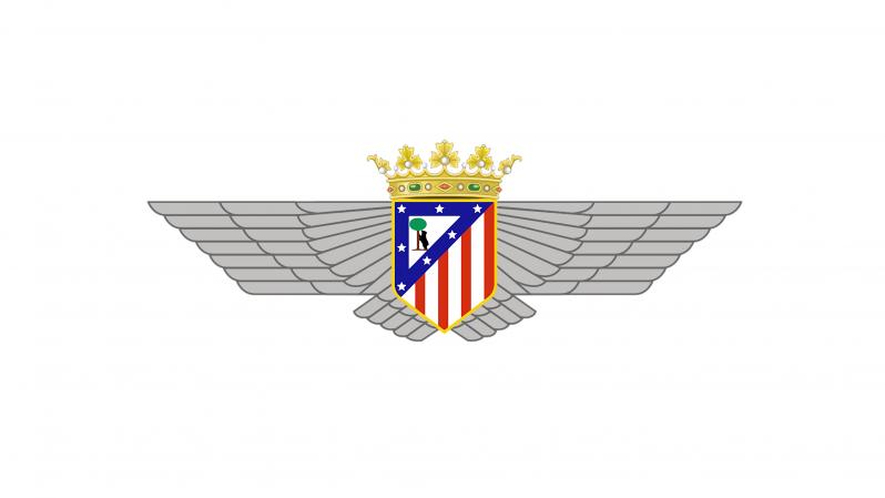
7. Atletico Madrid | 1942
8. Leicester City | 1983-1992

9. West Ham | 1975-1980
10. Manchester City | 1976-1981
11. Arsenal | 1994-1996
12. Celtic | 1988

13. River Plate | 1985-1986
14. Sporting de Gijón | 1950
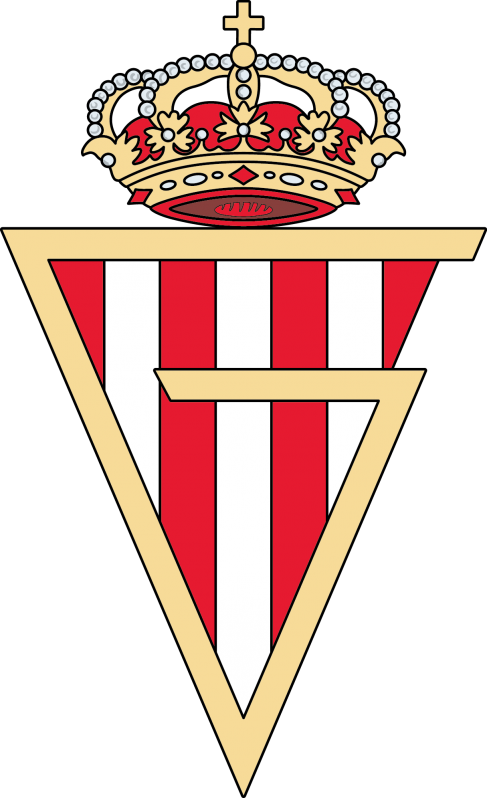
15. Borussia Dortmund | 1976-1978
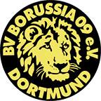
16. Eintracht Frankfurt | 1977-1998

17. Lille OSC | 1981-1989

18. FC Nantes | 1968-1973
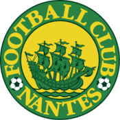
19. Olympique Marseille | 1972-1986

20. Club America | 1938-1946

21. Atalanta | 1963
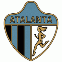
22. Minnesota United | 1976-1981

23. Derby County | 1946

24. Swansea City | 1980s
25. Fulham | 1931
