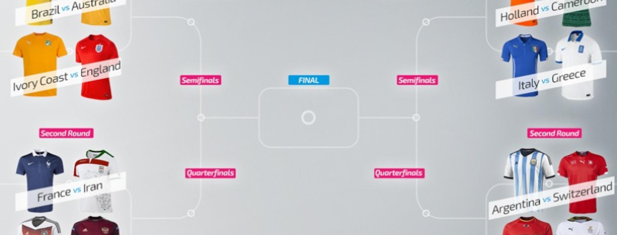
The 2014 FIFA World Cup in Brazil is less than a week away, but you don't have to wait. The18 brings you the results of the Round of 16 in our "2014 World Cup Kit Championship."
For those of you who may have missed our first installment in which we looked at uniforms for all 32 teams, here's the deal: We took all home and away kits for this year's FIFA World Cup field and put them into competition with one another. Based off the actual group pairings of the World Cup, we put the jerseys head-to-head and let them compete. Our judging criteria include tradition, creativity and innovation. Check out who moves on to the quarterfinals below:

![]() Brazil vs
Brazil vs

 Australia
First things first. Brazil and Australia have virtually the same kit aside from the colors. Which poses an obvious problem. But, since the World Cup is all about the host country and the imitation doesn’t really do it, most people will likely go with the classic Brazilian kit. Not to mention Brazil’s away blues with white shorts give the host country another sleek look. They also have a third kit in their arsenal, which we would love to see at some point in the tournament. Brazil moves on.

 Ivory Coast vs

 England
The English plain whites and reds are sharp, but compared to the Ivory Coast vibrant orange kits, it’s no match. Along with the spectacular Elephant crest, the Ivory Coast kit, the creativity pushes the Ivory Coast through. England’s classic look was enough to get them out of the group stage, but come elimination time, they fail to impress. It’s nothing against the Three Lions, but losing the round of 16 isn’t that uncommon for them… Jokes aside Cote de Ivory is on to the final 8.

 France vs

 Iran
Iran
France wins. Easy.

 Germany vs

 Russia
Now a lot of people (mostly Germans) are a little irked that Deutschland abandoned its signature white-on-black look. We're here to say this is for the better. The three shades of red on the chevron represent the three World Cups won by (West) Germany, and the change isn’t over the top. Their red and black away kits just feel and look "German" and scream intimidation. However, Russia’s maroon kits are pretty sweet, especially when you notice the Russian term "пoеxали" is printed on the back, translating as "Let's go!” My question is why maroon? It’s not a Russian color and they abandoned using it in 2009. Besides, Putin doesn’t even like shirts. On goes Germany.

 Netherlands vs

 Cameroon
Probably the matchup of the tournament. On one side, a classic all "Oranje" look reminding us what the term “Total Football” really means. The orange looks more vibrant this year, and along with the vector font, they are classic Dutch kits. BUT. Puma went all-in on Cameroon’s cave painting and indomitable lion kit. It’s almost like a work of art compared to a normal kit. Cameroon knows the tournament is every four years and they weren’t shy about showing off their patriotism. It is surely one of the most memorable of the tournament, and compared to the Dutch kit with one lion, this kit has at least 10. The African nation advances…barely.

 Italy vs

 Greece
The Italian’s jerseys are always a fan favorite. This year, Puma did just enough to change the classic blues and added some lovely pinstripes on the whites. The gold Puma logo is a good look, along with the country’s flag on the sleeve. Nike is the Greek Goddess for victory and the all-white Greek jerseys scream "truce." If it’s any consolation, the jerseys do match the Greek's boring style of play and fits perfectly with the sentiment, “We’re putting all 11 men behind the ball for 90 minutes and there is nothing you can do about it.” Greece loses. Azzurri move on.

 Argentina vs

 Switzerland
Switzerland had a good thing going until they put the Credit Suisse logo on the right shoulder. This isn’t a club team, it's the national team. We all know you guys love your banks, but lose the sponsorships. The Swiss watermark is cool, but this is always going to result in a loss. Argentina’s kits are some of the best in the tournament, combining a classic look with a new age feel. Their away kits with gold numbers aren’t to be messed with either. Albiceleste are on to the next one.

 Belgium vs

 Ghana
Ghana
It’s the first World Cup for Belgium since 2002, and the Red Devils are bringing a unique look to Rio. The watermark crown is a good touch, and their black jerseys are fierce too - but we wish the stripe across the chest went all the way. Ghana’s jerseys, just like Cameroon’s, capture what we are looking for. The whites provide a clean look with a little African flair on the neck, and the reds will not have trouble catching people's eyes in Brazil. A close call, but the Black Stars move through.
We are on to the quarterfinals. Who do you think will take The18.com's World Cup Kit Championship?


