The Major League Soccer expansion team for St. Louis hosted a live reveal of its club’s name, logo and colors Thursday morning and I ask that you mentally prepare yourself to be disappointed. Ladies and gentlemen, please welcome the 29th club of MLS — St. Louis CITY SC.
New profile pic, who dis? #stlCITYsc #OurCITYOurSpirit pic.twitter.com/utouQWE44b
— St. Louis CITY SC (@MLS4theLou) August 13, 2020
Where do I even begin?
Let’s start with positivity first. The colors knocked it out of the park. We’ve had our fair share of blue, red and green colored teams. MLS fans were ecstatic to finally have a pink team in the league with the introduction of Inter Miami, but the club’s jerseys looked like a pink shirt left in the sun for too long.
.@InterMiamiCF's inaugural home jersey has officially arrived: https://t.co/pNhp8YpA6W pic.twitter.com/kzWPJrFLXG
— Major League Soccer (@MLS) February 24, 2020
Despite St. Louis CITY SC calling it "city red," the club has the chance to do what Miami couldn’t and be the brightest, pinkest team in MLS. The color choice was bold and beautiful. Full marks for color choice. Score: 10 out of 10.
The spirit of a new St. Louis.#stlCITYsc #OurCITYOurSpirit pic.twitter.com/cKpcnjKO5J
— St. Louis CITY SC (@MLS4theLou) August 13, 2020
Now to the name.
St. Louis CITY SC. Why is "city" in all caps you might ask? We couldn’t tell you. Why do MLS expansion teams keep picking generic and boring European-themed names without coming up with a kickass name like the Seattle Kraken? Lastly, why are we still having clubs choose SC or FC — can’t we just agree on one?
Literally two months ago Charlotte FC revealed its name and logo, but now there is another SC club. The tally after the introduction of St. Louis CITY SC has "Team FC" leading with 13 clubs donning "FC" and now four clubs going by "SC." The soccer or football debate will never end.
The newest MLS club released a video explaining how St. Louis is, in fact, a city, just in case you didn’t know.
We are St. Louis CITY Soccer Club.#stlCITYsc #OurCITYOurSpirit pic.twitter.com/lw6liotZVG
— St. Louis CITY SC (@MLS4theLou) August 13, 2020
Name score: 3 out of 10. (Four points off for generic name, two points off for adding complexity to the SC/FC argument and one last point off for just copying the USL team name and adding ‘CITY’.)

Also, the club has to live with itself knowing it passed up on the option to be called the Dancing Parrots.
We hear there's a "major" soccer announcement today. Some campers in our soccer camp this week had some creative team name ideas for the new MLS team. Get your kicks and check them out. #MLS4thelou #soccer #MLS pic.twitter.com/GuhgstxlLo
— PRComEd (@PRComEd1) August 13, 2020
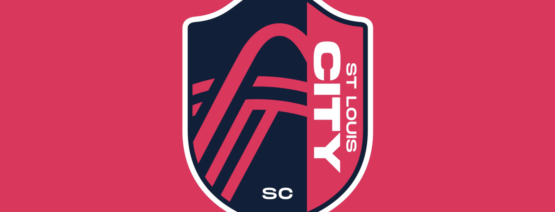
Last, and certainly least, comes the logo.
For the CITY. For the LOU.
See you soon, St. Louis City SC! pic.twitter.com/YKcQmen0Rr
— Major League Soccer (@MLS) August 13, 2020
With no background or explanation, please briefly explain the logo.
Here was my first thought when seeing the logo: Well the badge outline looks nice. I think that's supposed to be the St. Louis Arch over the top, but it also looks a little like a limp noodle hanging down? Also, what are the other lines supposed to represent — what am I looking at exactly?
After some quick research, the other lines below the arch are meant to portray the Missouri and Mississippi Rivers. After looking on Google maps the logo appears to be looking at the rivers intersecting, looking from West to East.

I will let the world of Twitter provide the score/reaction for the logo.
St. Louis City SC!!! I like City as the team name. The logo needs to be jazzed slightly to make the concept stand out better. The red Arch should be white or grey. My opinion of course. pic.twitter.com/YrRiREQtDL
— Amanda Linneman (@linneman_amanda) August 13, 2020
— AC21MMA (@aaroncrane21) August 13, 2020
If you’re looking for good soccer, head west at the Gateway Arch.
No, really. pic.twitter.com/4FFZ6Peefd
— Sporting KC (@SportingKC) August 13, 2020
Fixed it pic.twitter.com/gCYERx2nrJ
— Kyle Gunby (@kylegunby) August 13, 2020
David Leininger’s design runs circles around this pic.twitter.com/Khm4OTkzmU
— Thomas O'Malley IV (@tomalley_iv) August 13, 2020
St. Louis CITY SC will start play in MLS in 2023. I will still be thinking of the team like that video of the guy yelling “WACK!”.
The logo? Wack! The name? Wack! I think you get the point.


