The MLS expansion team in Charlotte received disappointing news on July 18 that the club’s inaugural season was pushed back due to the coronavirus. The moping for the new Charlotte team only lasted a couple days as spirits are high once again. On Wednesday morning the name and logo were released and received mostly positive reviews.
It’s official! @CharlotteMLS, coming to @mls in 2022, have unveiled their team name and logo.
Thoughts? pic.twitter.com/90IAyS14o4
— FOX Soccer (@FOXSoccer) July 22, 2020
Newly Minted pic.twitter.com/yCJ6c3bwcK
— Charlotte FC (@CharlotteMLS) July 22, 2020
It's all in the details pic.twitter.com/LALt75yF6l
— Charlotte FC (@CharlotteMLS) July 22, 2020
Let’s go ahead and breakdown the colors, name and logo of the newest face of MLS.
The Colors
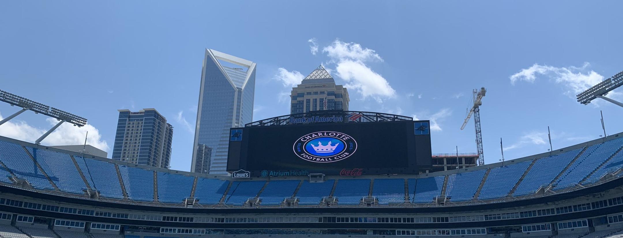
Charlotte FC will play in the same stadium as the Carolina Panthers of the NFL. Picking nearly identical colors as the Panthers was a wise decision. Unless the team in Charlotte becomes the next Atlanta United and sells out every game, there will be empty blue seats showing.
CLT skyline @CharlotteMLS pic.twitter.com/YTf7rcQMwI
— Ryan Bailey (@RyanJayBailey) July 22, 2020
How awkward would it be to have team colors of red, orange or yellow and then play in a stadium that has bright blue seat colors? Choosing similar colors to the already established NFL team is a smart move. I mean hey, it worked out pretty well for Atlanta United.
The Name
Charlotte Football Club. Nothing really to “ooh” or “ahh” with the name. On the bright side the club’s initials are “CFC,” so perhaps Chelsea fans might look at Charlotte like a little sibling. The name could have been better, but it also could have been way worse. At least the people in charge didn’t use a racial slur as a team name.
A look back at the past and future of MLS expansion team names shows a trend of European style naming of clubs. The list of names includes: Austin FC, Inter Miami FC, Nashville SC, FC Cincinnati, LAFC, Atlanta United, Minnesota United and now Charlotte FC. While many were quick to criticize Charlotte’s “boring” name, one look around shows it’s just a part of the times in MLS.
Also thank god the club wasn’t named “Charlotte SC.” The amount of people saying, “I thought Charlotte was in North Carolina,” would be overwhelming.
The Logo
The badge of Charlotte FC is where the club knocked it out of the park.
Thank you for your support!
Retweet this for a chance to win our NEWLY MINTED gear! pic.twitter.com/OWCBv74nNX
— Charlotte FC (@CharlotteMLS) July 22, 2020
For the people wondering why “Minted 2022” is on the logo here is why: The city of Charlotte’s rich history of being the first city in America to have its own branch of the U.S. Mint is acknowledged on the logo. (No not mint as in the one you eat after dinner, mint as in an industrial facility that manufactures coins.)
The logo also nods to the history of the city’s name and the royal legacy behind it. During the city’s founding in 1768, it was named after queen Charlotte Sophia of Mecklenburg-Strelitz. The four-pointed crown has each spire of the crown representing the four wards in Charlotte.
The historical significance behind the logo is so much better than slapping a random animal on the crest and calling it a day. Speaking of crests, Charlotte’s secondary look is something else to marvel at.
The secondary logo for Charlotte FC pic.twitter.com/d760DD7iqv
— The18 (@the18com) July 22, 2020