
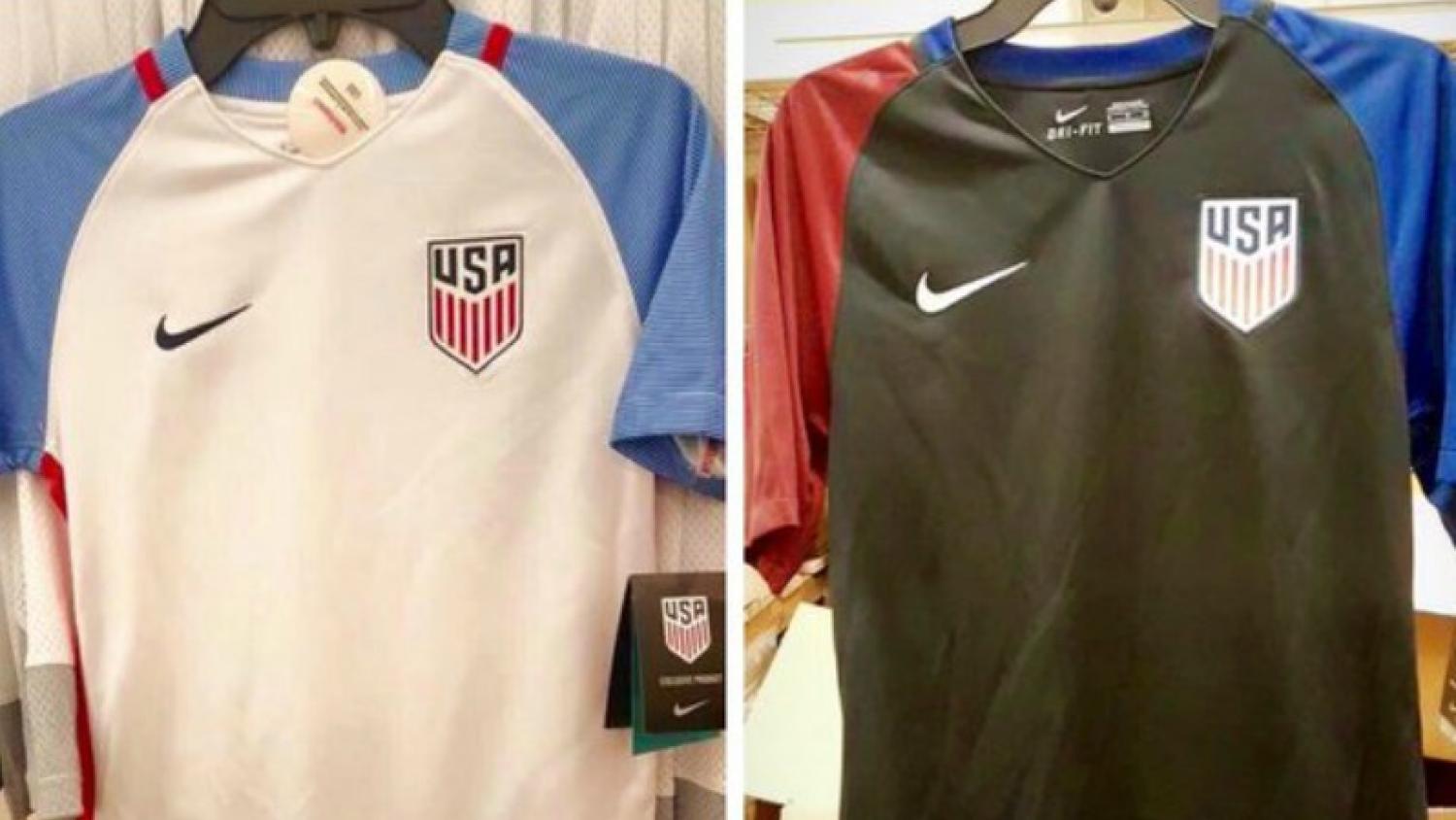
A few weeks ago, US Soccer unveiled the new national team crest. Some people liked it. Some did not.
Ignoring the possibility US Soccer plagiarized the crest from a Florida youth baseball league, we wanted to get an actual expert opinion on the new crest. So we got five.
The18 shares an office with a branding/advertising firm called Greenhouse Partners, and we asked several members of the creative team what they thought of the new look. Below are their responses.
Here's the old crest (left) and the new crest (right), for the sake of comparison.

Photo: @bwfast | @ASarcasticHorse | Twitter
Joel (Art Director): "Well it's following the trend that everything is, which is simplification, which is, in my opinion, good. This (the soccer ball in the middle of the old crest, as well as the stars and the extra stroke around the badge) is totally unnecessary. It's kind of superfluous, they took all that (expletive) out, which, I would have done the same thing. The type is more modern. I fits in better with the whole thing."
Elliott (Art Director): "It's simpler, which is the trend these days, but I think it's oversimplified. It's definitely more modern. The geometry makes it a bit too tall. But the typography is stronger. Overall it's a nice evolution, but it misses the mark a bit."
Kelsey (Art Director): "I think that they maybe lost the idea that it's a soccer team? (laughs) I mean, it's clearly USA. I like that they kept the shield. They probably could have tried to incorporate something that still felt like it was soccer versus a Captain America shield. But, it's clean. Flat, modern design. I feel like it looks like a Captain America shield, but I like the design."
David (Senior Creative Associate): "(The previous crest) feels a little dated. Like, a decade, at least, dated. It's got too much detail. This one, I think it would scale down smaller, which is a good thing for a website, and still be completely legible. So, I definitely like this one better. There's too much going on (in the previous one)."
TJ (Chief Creative Officer): "It's better in a lot of ways. One: it's much, much cleaner and it looks very current. I'm looking at the (previous) crest, by example, and it feels dated. You get, immediately, the flag. You get, immediately, USA. I like the idea that it looks like a soccer crest that a lot of teams have. So it feels very sports-y at the same time. Again, the simplicity is the best thing about this thing. And the "One Nation One Team" thing is also a really nice tagline to tie it all together in a nice little bow."
Contact The18 Staff Writer Sam Klomhaus at Klomhaus@The18.com or follow him on Twitter @SamKlomhaus
For more about Greenhouse Partners, visit greenhousepartners.com